Start with the job of the shadow
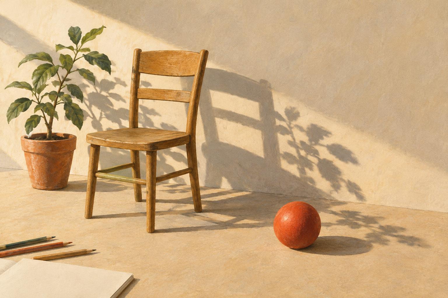
A cast shadow is the dark shape an object projects onto another surface when it blocks light. Unlike shading on the object itself, it shows how that object relates to its surroundings. A shadow beneath a chair helps its legs meet the floor; a shadow crossing a wall can reveal how close a character stands to it. Before drawing one, ask what the viewer needs to understand about the scene.
Not every object needs a fully described shadow. In a busy illustration, a few well-placed shapes may establish the lighting more clearly than a web of small, competing marks. Prioritize shadows that explain contact, distance or an important gesture. If a shadow does none of those jobs, consider simplifying or leaving it out. Deliberate omissions can keep attention on the story rather than on the mechanics of the lighting.
Choose a light direction and keep it consistent
Mark the main light source outside your drawing or on a disposable sketch layer. Then make a quick arrow showing the direction light travels across the scene. Objects will generally cast shadows away from that source. This simple note is especially useful when an illustration contains several figures, pieces of furniture or architectural details that must share the same space.
Use one easy object as a test before working across the whole image. Sketch the shadow of a box, stool or standing figure, and check whether its direction suits the composition. A low light source tends to produce longer shadows; a higher one generally produces shorter shadows on the ground. You can bend these relationships for a stylized image, but the major shadows should still feel like parts of one visual system. If the chosen direction hides an important face or action, change it early rather than repairing every shadow later.
Build the shape from the surface it falls on
A cast shadow is not simply a dark copy of the object. Its outline depends on both the object and the receiving surface. On level ground, start at the points where feet, wheels or furniture legs touch the floor, then extend the shadow away from the light. Where a shadow climbs a step or crosses a wall, let its shape change direction at the boundary. That shift helps describe the surface without requiring extra lines.
Begin with a broad, simple silhouette rather than tracing every notch along the object's edge. Include a distinctive feature only if it helps the reader recognize what casts the shadow or understand an action. For example, the shadow of an outstretched arm might reinforce a pointing gesture, while the separate shadows of five fingers could become distracting texture. Check the result at thumbnail size: the shadow should support the scene even when its finer contours disappear.
Use contact and edge quality to suggest distance
The darkest or most definite part of a shadow is often near the point where an object meets a surface. In an illustration, a compact contact shadow beneath a shoe, cup or table leg can prevent that object from looking as though it floats. It need not be large. A narrow patch that clearly connects object and ground may do more work than a long shadow with an ambiguous starting point.
As a shadow travels away from its source, its edge may appear softer, particularly with a broad light source. You do not need a smooth blur to suggest this: a softer drawn contour, lighter value or less detailed edge can be enough. For a crisp graphic style, keep most edges hard but reserve the sharpest contrast for contact areas. Adjust these choices to your visual language rather than mixing sharply rendered shadows with otherwise loose, simplified forms by accident.
Make a quick readability check before finishing
Fill the proposed shadows with one temporary flat color and view the image small. Ask whether the character remains easy to identify, whether important objects still separate from the background and whether the ground plane feels believable. If a shadow merges two figures into one confusing mass, break it apart or lighten one section. If it creates a stronger focal point than the action, reduce its contrast or detail.
For practice, draw a simple scene with a figure beside a table and a wall behind them. Make three tiny versions using the same objects but different light directions. In each version, place only the shadows needed to show where the figure stands and how the table sits in the room. Compare which arrangement explains the space most quickly. This exercise treats cast shadows as design shapes first and lighting effects second—a useful approach whenever clarity matters more than exhaustive realism.