Decide what the viewer needs to see first
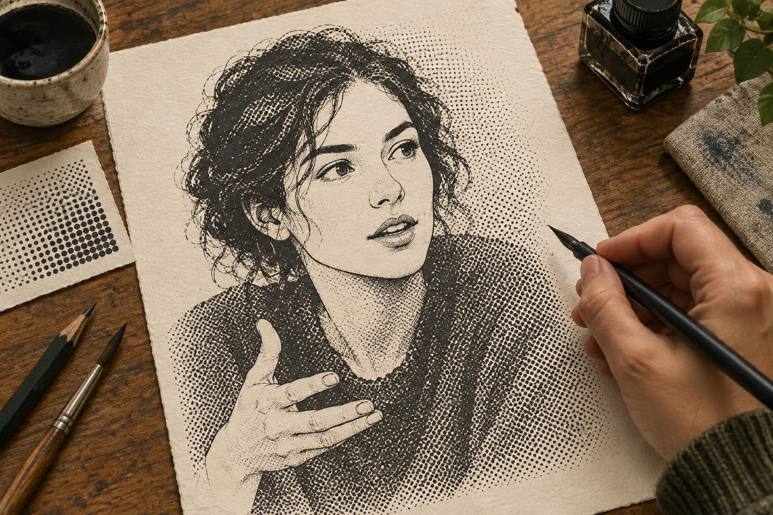
Halftone shading uses a pattern of dots to suggest a middle value between a light surface and a dark one. It can make a flat shape feel rounded or give a drawing a print-inspired texture. Yet dots also add visual information. Before applying them, identify the parts of the illustration that must read immediately: a character’s expression, the shape of a hand, the edge of an object or the direction of a gesture.
Start by viewing the drawing at roughly the size someone will encounter it. If a small area already contains many lines, it may not need patterned shading. Let clear outlines and open spaces carry the most important information. Reserve stronger halftone for broader planes, background shapes or areas where a slight loss of detail will not change the meaning of the image.
Build a value plan before adding dots
A halftone layer works best when it has a job beyond making every surface look textured. In a simple value plan, separate the image into light, middle and dark areas. The light areas can remain open, the middle areas can receive halftone, and the darkest areas can use solid fills or closely controlled pattern. This gives the eye a path through the picture and prevents an even coating of dots from flattening it.
For a quick test, shrink the image or step back from it. The main subject should still stand out from its surroundings. If the background pulls as much attention as a face or focal object, lighten its halftone, reduce its coverage or remove it near the subject’s outline. The aim is not to eliminate texture; it is to make texture support the visual hierarchy.
Choose dot size and density with linework in mind
Small, closely spaced dots can appear smooth from a distance, but they may merge with fine hatching, lettering or tiny facial features. Larger dots are easier to recognize as a pattern, though they can overpower delicate contours. Neither size is universally better. The useful choice depends on the scale of the finished image and how the dots sit beside the existing marks.
Test a few densities in the busiest part of the drawing, not only on an empty swatch. Check whether an eyebrow still separates from the eye, whether fingers remain distinct and whether the edge of a dark object stays legible. If details begin to disappear, try a lighter screen or a larger area of untouched paper rather than sharpening every line. A narrow gap between the halftone and a key contour can give that contour room to breathe.
Use placement to describe form
Halftone does not have to fill an entire shape. A band along the underside of a sleeve can suggest a turn away from the light, while a patch beneath a chin can help separate the head from the neck. Concentrating dots where they explain form often does more than covering every midtone surface. Gradual changes in density can be useful, but a clean edge between patterned and unpatterned space can also suit a graphic style.
Keep the pattern’s boundary intentional. It might follow the curve of a cheek, stop short of an eye or sit behind a figure to increase separation. When working digitally, place halftone on a separate layer so it can be masked or adjusted without changing the drawing. With physical screentone or other applied patterns, test placement on a copy or tracing overlay before committing to the final art.
Check the final viewing conditions
A halftone that looks crisp while zoomed in may look muddy when reduced. Export or print a small test at the intended size and inspect it at a comfortable viewing distance. Look especially for dots merging into lines, dark patches closing up and important expressions becoming harder to read. Also check a grayscale version if color differences are doing too much of the work of separating shapes.
If the illustration will be printed, fine patterns may behave differently depending on the printing process and paper. Digital resizing can also make regular dot patterns look uneven or produce distracting interference. Testing an output sample is more reliable than judging the working file alone. When in doubt, simplify: fewer halftone areas with a clear purpose often give the drawing more depth than a dense pattern everywhere.