Let the surface do some of the drawing
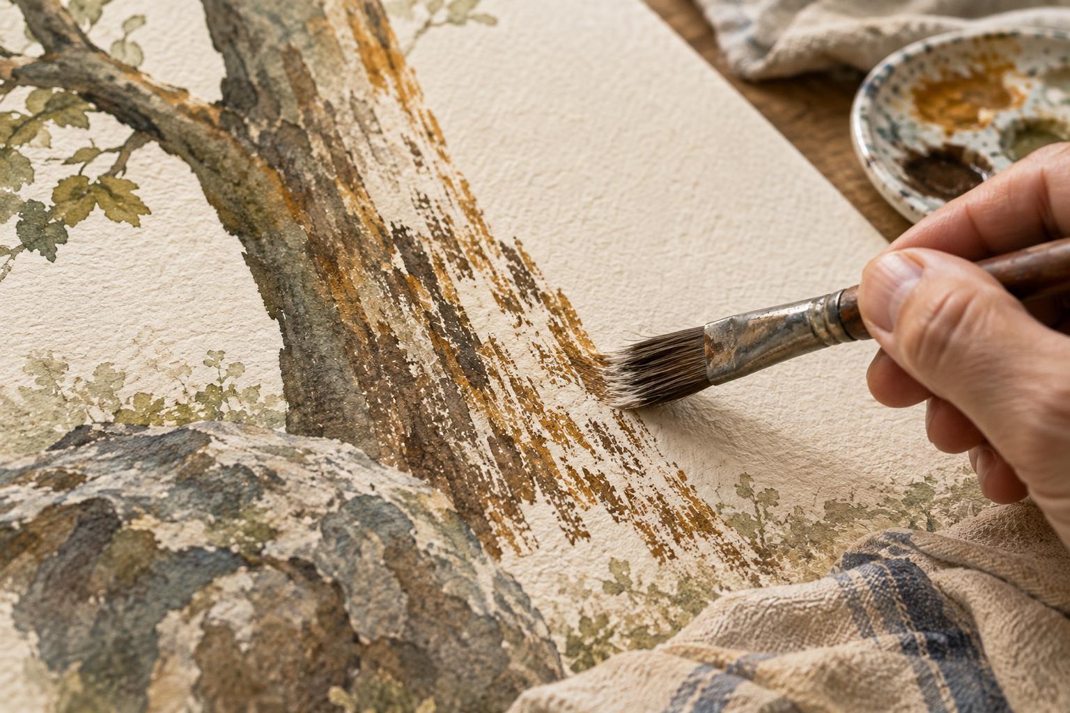
A textured subject can tempt you to draw every crack, thread or patch of roughness. That approach may take a long time, and the accumulation of marks can make an illustration harder to read. Dry brush offers a different choice: drag a brush carrying relatively little paint across a surface and let the broken stroke suggest many small details at once.
The effect comes from the relationship between brush and surface. On textured paper, paint catches on raised areas while leaving small gaps. On smoother paper, a brush with separated bristles may leave streaks instead. Neither result is automatically better. The useful question is whether the marks help a viewer recognize the material, understand the light or notice the focal point.
Set up a brush that skips, not floods
Start with a shape that already reads clearly as a tree trunk, coat, wall or other subject. Dry brush works best as a layer over that structure, not as a substitute for it. Load a flat, round or worn brush with a small amount of paint, then wipe excess onto a cloth or scrap paper. On a test surface, pull one stroke with light pressure. If it makes a solid band, remove more paint; if it leaves almost nothing, reload slightly.
Paint consistency matters as much as quantity. Gouache, acrylic and ink can all make useful broken marks, but they behave differently. Thick paint may catch sharply; heavily diluted paint may soak into paper and lose the skipping effect. With watercolor, a relatively dry brush and modest moisture on the paper help preserve gaps. Test on the same kind of surface you plan to illustrate, because a technique that works on rough paper may look quite different on smooth stock.
Hold the brush loosely and move it in the direction that suits the form. Short sideways passes can suggest stone or worn plaster; longer strokes can follow wood grain or folds in fabric. Try changing pressure within a stroke rather than repeating identical marks. Work from light to heavy coverage: it is easier to add another pass than to recover an area filled with texture.
Choose a few convincing clues
Texture becomes more persuasive when it follows the subject. For bark, vary the length of marks and let them run along the trunk, bending where the form bends. For a knitted sleeve, a soft broken edge and a few directional strokes may say more than rows of individually drawn stitches. A weathered wall might need clustered patches near corners and seams, with broad quiet areas left between them.
Think about scale before touching the page. A close-up object can support larger, more distinct marks. A distant building or background tree usually needs smaller, simpler ones. If every surface receives the same density of dry brush, materials begin to look alike. Reserve your strongest texture for places where it clarifies a change of material, a plane turning toward the light or an important area of the composition.
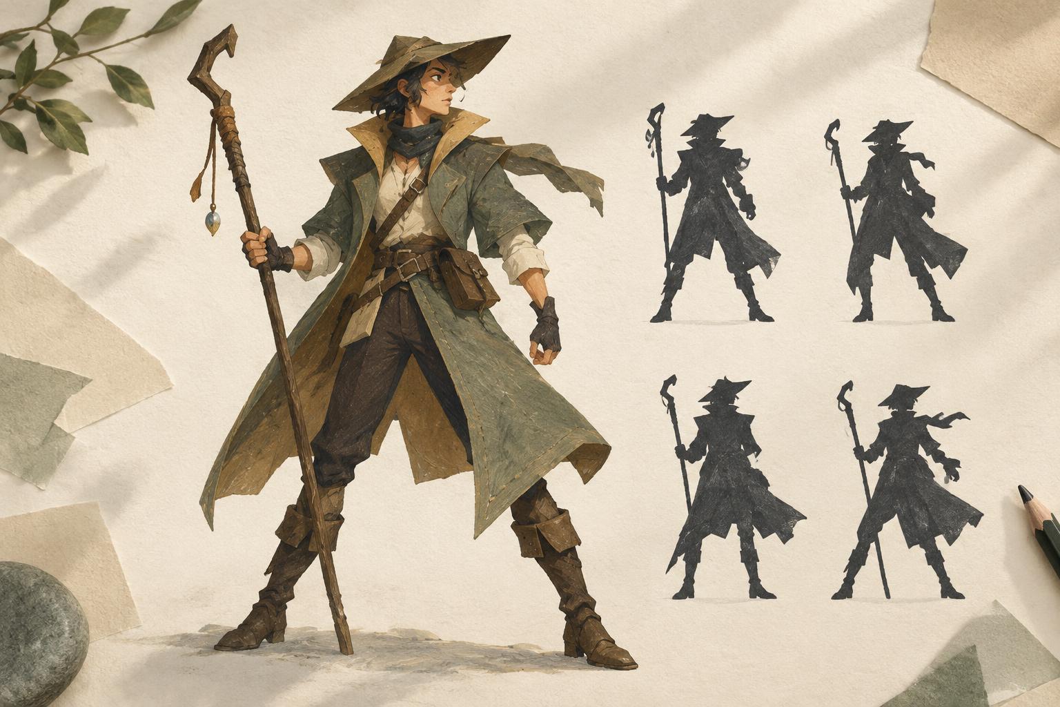
Leave room for the viewer to complete the pattern. A few scratches at an edge can imply a rough surface across the entire shape. Keep some passages nearly smooth so the textured ones have contrast. This selectivity is especially useful in visual storytelling, where a face, gesture or action may need to remain clearer than the setting around it.
Keep broken marks under control
Before adding texture, decide which edges should stay crisp. Dry brush dragged across a silhouette can make a shape appear ragged, which is useful for fur or foliage but distracting on a clean-cut object. Stop strokes short of important edges, use a smaller brush nearby, or restore an edge after the texture has dried.
If a passage grows too busy, first pause and assess it at the size the illustration will be viewed. Individual marks that seem loud up close may merge into a gentle tone at a distance. If the area still competes with the focal point, cover selected marks with an opaque base color when the medium allows, or simplify the surrounding shapes. Avoid trying to fix clutter by adding the same texture everywhere; that usually removes the contrast the image needs.
A useful exercise is to paint one simple object three times. In the first version, add dry brush across the whole shape. In the second, place it only where the surface changes direction. In the third, use just a few marks near the focal area. Compare which version communicates the material most clearly at a glance. The goal is not the most texture, but the smallest amount that tells the story.