What the label tells you—and what it does not
The main difference is the liquid that carries the marker’s color. Alcohol-based markers use an alcohol solvent; water-based markers use water. That difference affects how ink moves across paper, how quickly a mark dries and how easily one stroke can disturb another. It does not tell you everything about a marker. Tip shape, ink formulation and paper can change the result considerably.
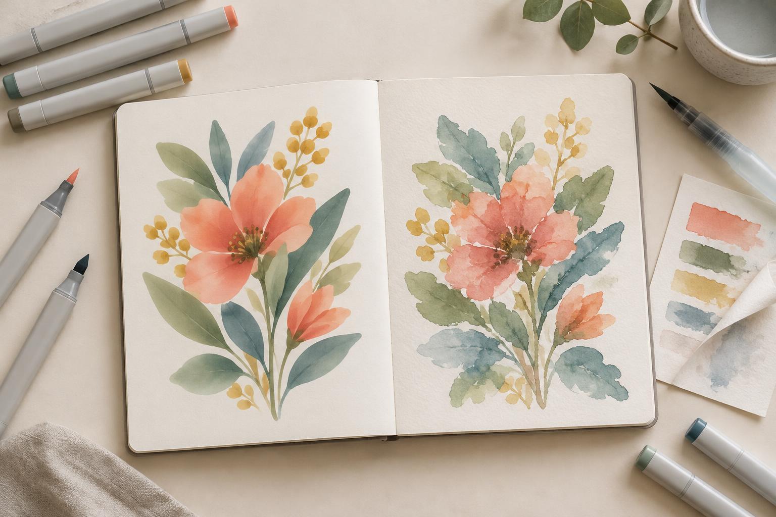
Both types can suit finished illustration. Alcohol markers are often chosen for smooth areas of color and soft transitions. Water-based markers can make crisp strokes, transparent layers or expressive textures, depending on the pen and surface. Neither type is automatically more professional. The useful question is whether its behavior helps you make the kinds of images you want to draw.
Blending, layering and texture
Alcohol markers tend to remain workable briefly after a stroke lands. Adding a neighboring color while the area is still damp can soften the join, especially on paper made for marker work. Repeated passes usually deepen the color, though too many can oversaturate the sheet. Large, even fills take practice: keeping a wet edge and working in a consistent direction can help reduce visible bands.
Water-based markers vary widely. Some make distinct strokes that remain visible when layered; others can be blended with a damp brush or with more ink. Adding water may create washes and softened edges, but it can also wrinkle thin paper or spread beyond the intended shape. Test whether a dried layer lifts when you go over it again. That behavior can be useful for texture, but frustrating when you need a clean, flat fill.
Think about the marks your illustration calls for. Smooth shading across a character’s face may be easier with an alcohol marker and suitable paper. A sketchbook scene built from visible hatching, broken color and occasional washes may benefit from a water-based pen. These are starting points, not rules: a small test will tell you more than the marker category alone.
Paper, linework and the back of the page
Paper is part of the tool. Alcohol ink commonly bleeds through ordinary sketchbook sheets, so place a spare sheet beneath your drawing and check the reverse before using a bound notebook. Marker paper may reduce bleed and help ink blend, but surfaces differ. A very absorbent sheet can drain ink quickly and make edges look fuzzy; a less absorbent one may keep color near the surface longer.
Water-based markers can also feather on absorbent paper. If you blend them with water, choose paper that tolerates moisture and let it dry before judging the final color or flatness. For either type, make a small swatch on the exact paper planned for the illustration. Include a heavy fill, a second layer and a line drawn over the dried color.
If you draw outlines first, check that your liner stays put under the marker. An ink described as waterproof may still react differently to an alcohol solvent, and a line that works with one water-based marker may smudge under repeated passes with another. Let the outline dry fully, then test a stroke across it. Testing is much easier than repairing a blurred face or speech balloon.
Practical considerations beyond the drawing
Consider where and how you work. Alcohol markers have a noticeable solvent smell, so use them in a well-ventilated space and follow the product’s handling guidance. Water-based markers may be more comfortable for some shared workspaces, though that depends on the individual product. Keep caps on when pens are not in use, and store them as the manufacturer recommends.
A marker’s purchase price is only one part of its cost. Check whether individual colors can be replaced, whether refills or spare nibs are available, and whether the colors you use most can be bought without replacing a whole set. A small collection of reliable colors may serve you better than a large assortment with gaps in the values you need. Also consider how easily you can identify each color after it dries; cap colors are not always dependable guides.
A ten-minute comparison exercise
Draw the same simple subject twice: a mug, a leaf or a small character with one shadow. Use the same paper size and limit each version to three colors. In each drawing, fill one broad shape, blend two colors at an edge, add a second layer after drying and draw a fine line over the result. Put a spare sheet underneath and check it when you finish.
Compare the drawings for qualities that matter to you, not just for which looks smoother. Did one marker help you control the shape? Which one made the texture you wanted? Did the paper buckle, feather or bleed through? Note how much waiting, layering or correction each version required. Keep the tests as a reference for future projects. Choosing markers becomes simpler when you can match their behavior to a specific illustration rather than trying to find one perfect tool.