Why work with five values?
A pencil can produce many shades, but trying to judge every subtle difference at once can make a drawing harder to plan. A five-value scale reduces that range to five useful steps: the lightest light, a light gray, a middle gray, a dark gray and the darkest tone you can make with your pencil and paper. These steps give you a shared reference when you move from an observed subject to a drawing.
Think of the scale as a planning tool, not a rule that every drawing must display five separate bands. A simple scene might need only three values. The advantage of making five is choice: you can decide where to leave paper showing, where to group forms together and where a strong contrast will help the viewer read the image.
Set up a scale you can compare
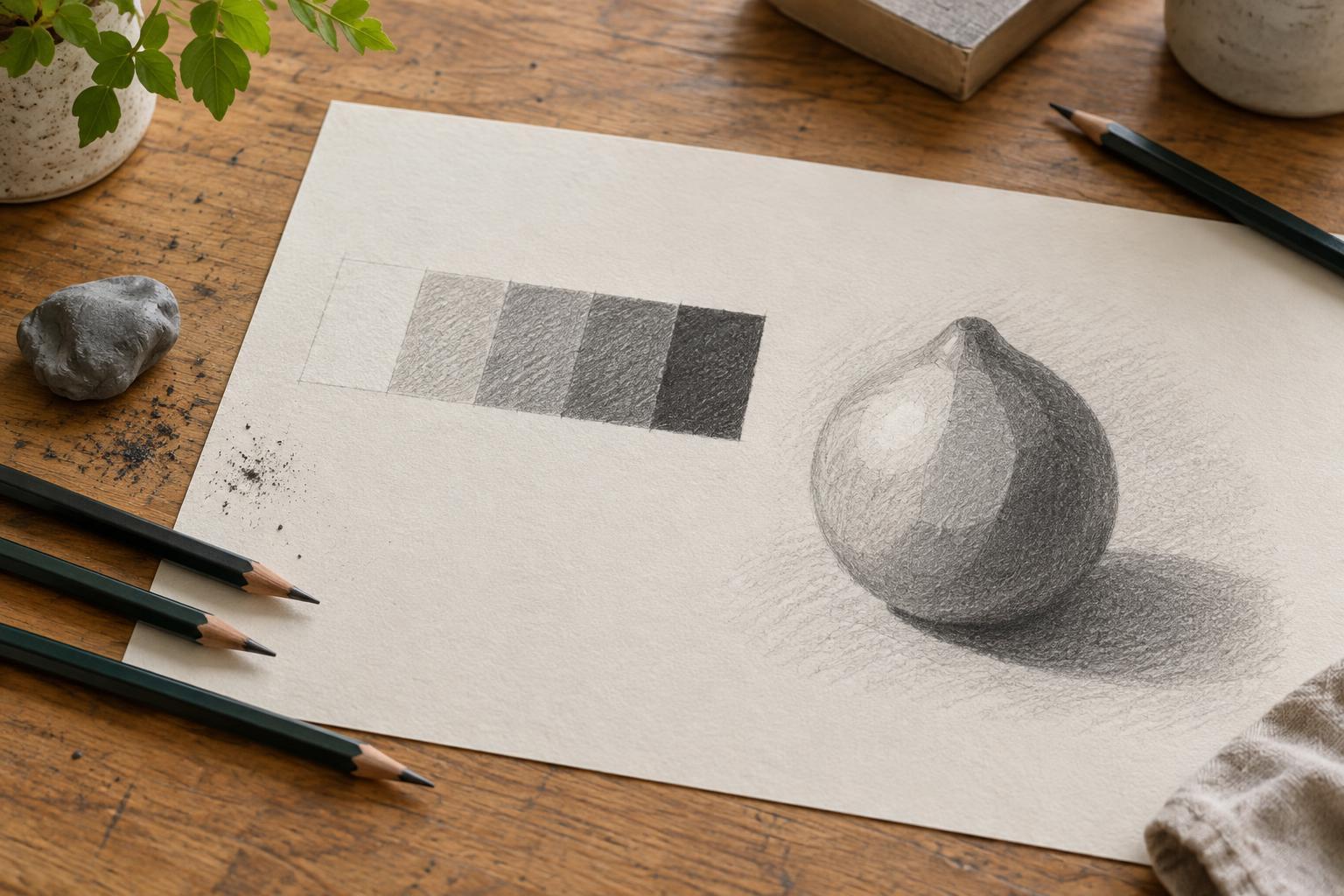
Draw five equal boxes in a row on a spare piece of the same paper you intend to draw on. Label them 1 through 5. Leave box 1 untouched so it represents the paper’s white. Fill box 5 with the darkest even tone your pencil can make without tearing the paper or creating a heavy, shiny patch. Using the same pencil throughout is enough for this exercise; a softer pencil may offer a darker endpoint, but it is not required.
Next, fill box 3 with a gray that looks roughly halfway between boxes 1 and 5. Make box 2 a clear step lighter than 3, and box 4 a clear step darker. Work across each box with consistent strokes, then add another light layer where needed. Layering usually gives you more control than pressing hard at the start. Try to keep each box fairly even so you are comparing values rather than patches of texture.
Check the spacing between steps
Place the scale at arm’s length and look for five distinct steps. If boxes 3 and 4 merge, darken 4 slightly; if 2 looks almost white, add a light layer. You can also narrow your eyes to make fine pencil marks less noticeable. The goal is not a measured gradient. It is a set of tones you can recognize quickly while drawing.
Pay attention to the paper and lighting as you check. A textured sheet may break a tone into visible specks, while strong light can reveal graphite shine. Those effects do not make the scale a failure. They show how your materials behave. Keep this sheet beside your work rather than trying to recreate its exact shades from memory.
Use the scale to plan a drawing
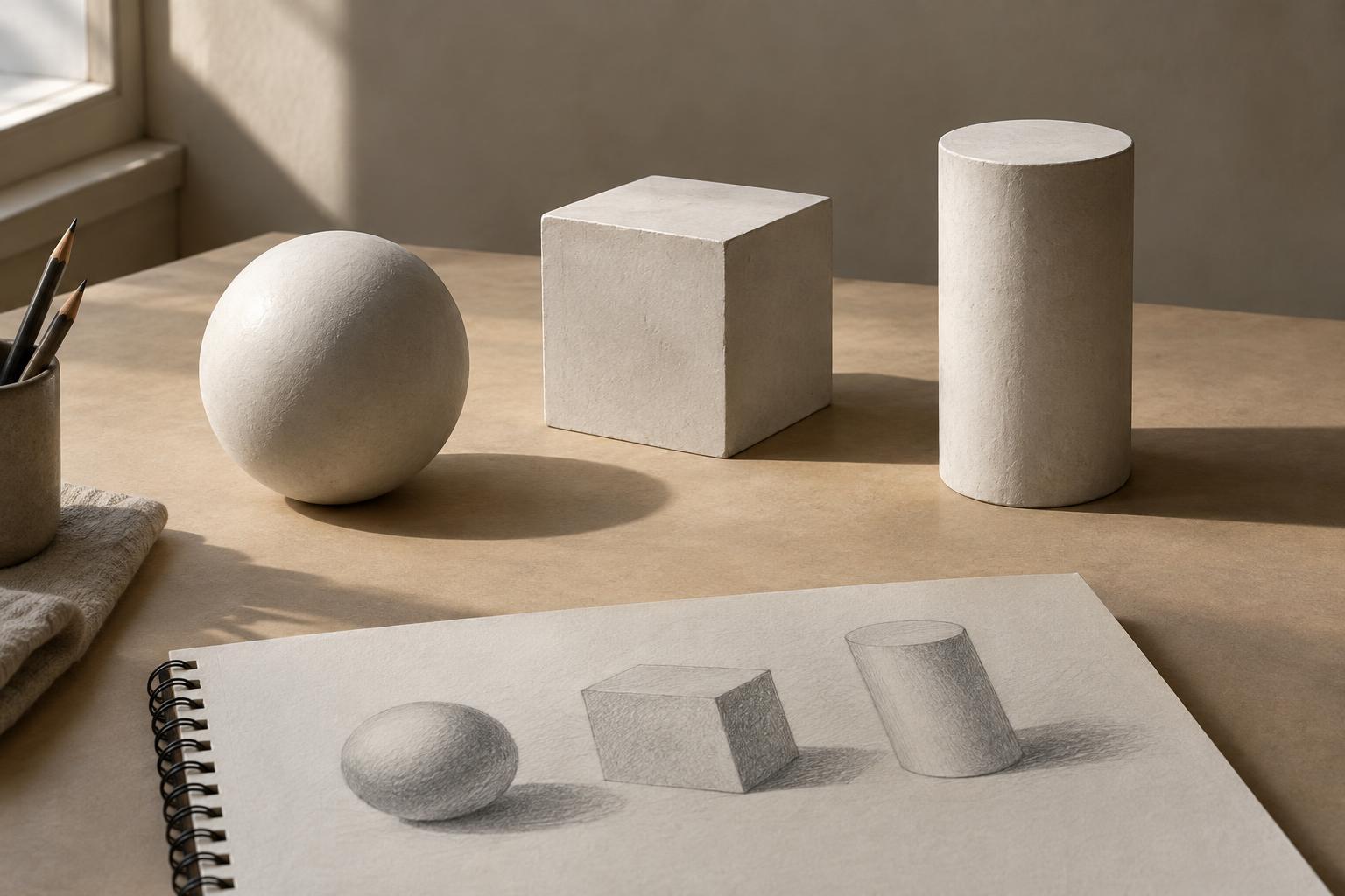
Choose a simple subject, such as a mug beside a piece of fruit, and identify its largest light and dark areas before drawing small details. Assign each area one of your five numbers. For example, you might reserve 1 for the brightest part of the mug, use 2 and 3 for its lighter surfaces, and group its shaded side and the cast shadow into 4 and 5. The assignments are relative to this drawing, not permanent labels for those objects.
Make a small thumbnail first. Fill its major shapes with your chosen values, even if the result looks blocky. Check whether the subject still reads at a glance. If it does, you have a useful foundation for a larger drawing. As you refine the forms, you can introduce gentler transitions within each area without losing the main value pattern.
Keep the darkest marks intentional
Value 5 is especially useful when it is placed deliberately. A few dark accents can clarify where forms overlap, where an opening recedes or where an object meets its cast shadow. If every shadow receives the darkest tone, those distinctions become harder to see. Compare dark areas with one another before deepening them, and leave room for the marks that matter most.
To practice, draw the same small subject twice. In the first version, use all five values. In the second, use only boxes 1, 3 and 5. Notice which shapes remain clear and which need an intermediate step. This exercise helps you treat the scale as a flexible set of decisions rather than a chart to copy. Over time, the five boxes can become a quick way to ask a useful question: what needs to be lighter or darker for this drawing to make sense?