What line weight can tell the viewer
Line weight is the apparent thickness and darkness of a drawn line. If every contour has the same weight, the viewer can still recognize the subject, but some edges may compete for attention. Variation gives those edges different jobs. A heavier mark can bring a shape forward; a lighter one can let it recede or suggest an edge that is only faintly visible.
Think of line weight as a guide rather than a fixed rule. Thickness alone does not create depth: placement, overlap, value, and the shape of the contour matter too. Start by deciding what the drawing needs to communicate. Is one object in front of another? Does a rounded form turn away from the viewer? Once that question is clear, you can choose which lines deserve emphasis.
Give the front edge more presence
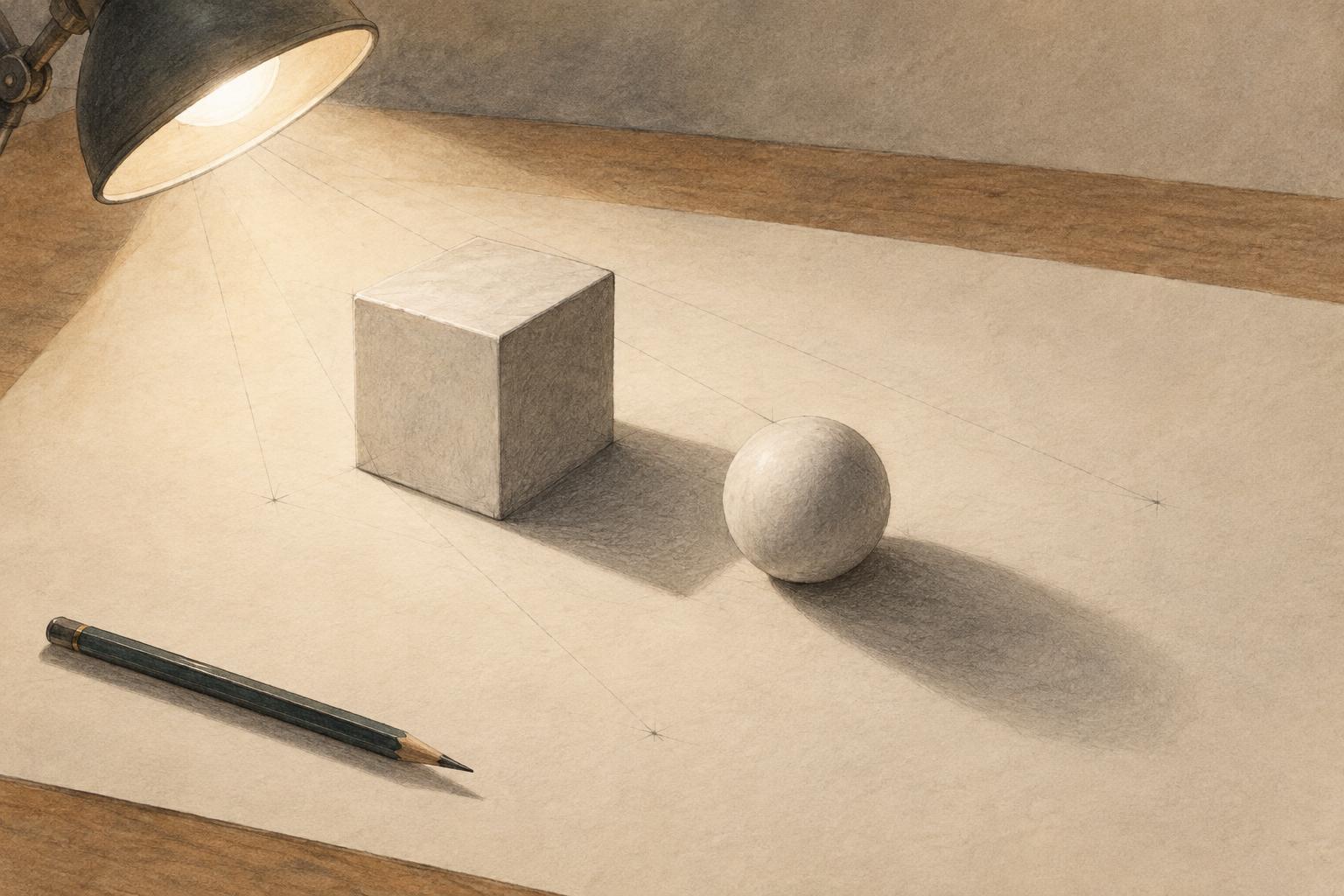
Overlap is one of the clearest places to change weight. Draw two simple shapes so that one partly covers the other. Make the visible edge of the front shape a little heavier near the point where they meet, while keeping the rear shape’s edge lighter. That small contrast helps the viewer read which shape sits closer without requiring shading.
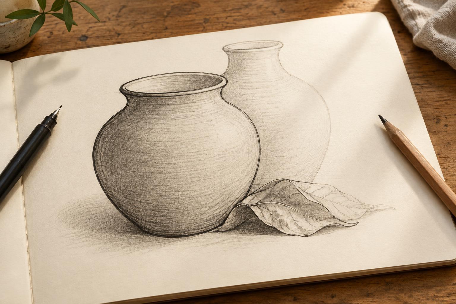
The effect is often strongest when it is selective. If the entire foreground object receives a thick outline, it may look cut out and pasted on. Instead, strengthen a few short stretches: where a hand crosses a sleeve, where a cup rests against a tabletop, or where one leaf passes in front of another. Let the line taper as it travels away from the overlap. The eye will usually connect the remaining edge without needing a continuous dark border.
Use lighter lines as a form turns
On a rounded object, a firm contour can gradually soften as the surface appears to turn into light or away from the viewer. Try drawing an egg or a simple cylinder. Vary the pressure along its outside edge, leaving some parts pale or briefly broken. Then add a few curved interior lines that follow the surface rather than cutting straight across it. These marks can reinforce the sense of volume.
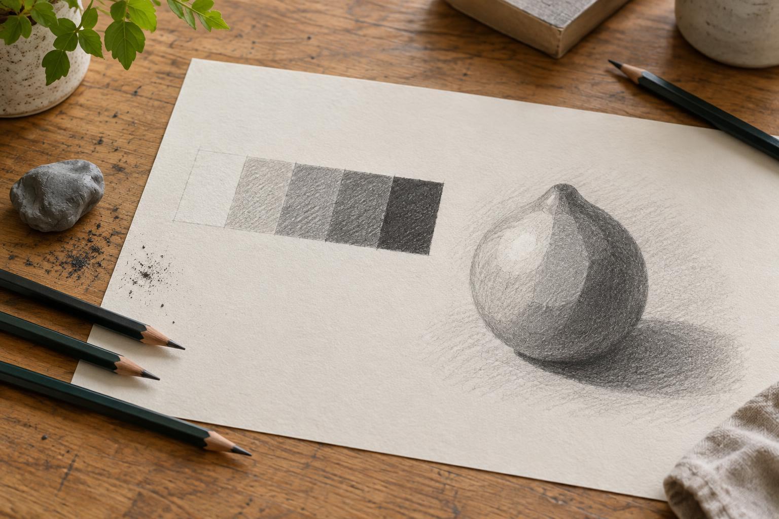
One useful starting convention is to make edges on the shadow side somewhat heavier and edges on the light side lighter. This is not a law of lighting, and it will not suit every style or scene. Check the shapes in your drawing before applying it. A dark background, for example, may make a light contour more visible than a dark one. What matters is that the changes support the form instead of becoming a decorative pattern.
A disappearing line can be as useful as a thick line. If a shoulder curves gently into a lit background, you might leave a gap in its contour. If the edge reappears at a sharper turn, resume it with more pressure. Alternating clear and implied edges encourages the viewer to complete the shape while keeping the drawing open and lively.
Match the method to your tool
With a pencil, vary pressure before reaching for a different grade. Build a heavier passage with a deliberate stroke rather than repeatedly tracing an uncertain one; repeated correction can make an edge fuzzy. A flexible nib or brush pen responds more dramatically to pressure, so practice slow strokes that swell and taper. With a fixed-width fineliner, you can add weight by drawing a second, closely spaced pass along only part of a line.
Digital brushes offer pressure settings and easy revisions, but the same decisions apply. Choose a brush whose response you can predict, then work at a viewing size that lets you judge the whole drawing. An edge that looks bold while zoomed in may barely register when the image is reduced. Whatever the tool, test two or three distinct weights rather than trying to produce endless subtle variations at once.
Practice with a small line-weight study
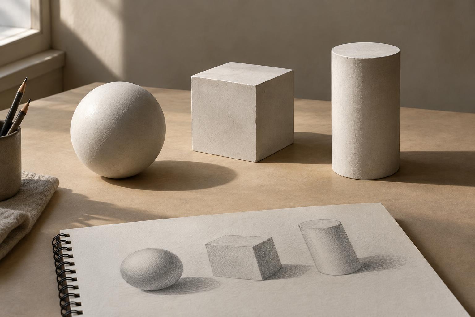
Arrange three ordinary objects so they overlap: for example, a mug, a folded cloth, and a book. Sketch their shapes lightly. Before darkening anything, identify three kinds of edge: the frontmost overlaps, the quieter outer contours, and the edges you could omit. Assign each kind a different treatment, such as heavy, light, or broken. Keep the study small enough to finish without becoming absorbed in details.
When it is done, look at it from across the room or shrink it on screen. Can you tell what sits in front? Does any thick line draw attention to an unimportant corner? Adjust just a few edges and compare the result. You can repeat the same arrangement with the light coming from another direction, or draw it once with only two line weights. The goal is not a perfectly outlined object; it is a readable drawing in which each line earns its place.