Know which problem you are trying to solve
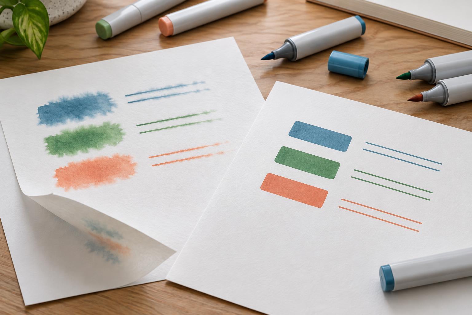
A marker that crosses the edge of a drawn shape is behaving differently from one that stains the sheet underneath. Feathering is the fuzzy spread of ink along paper fibers, often visible around fine lines or areas of flat color. Bleed-through happens when ink passes through the sheet. You may also notice show-through: a mark visible from the back even though little or no ink has reached the surface there. A crisp front can still have significant show-through.
These distinctions matter because paper can solve one problem without solving the others. A thin sheet with a marker-resistant treatment may keep edges sharp and limit bleed-through, while a thicker untreated drawing paper may absorb a wet marker stroke and produce soft edges. Paper weight, usually expressed as grams per square meter (gsm), tells you something about a sheet’s mass, but not enough about how its surface handles ink.
Match the paper to the marker
Alcohol-based markers lay down fluid color that can spread into an absorbent surface. Papers sold specifically for alcohol markers are often designed to slow that absorption, giving strokes a better chance of staying within their intended edges. Some are quite thin, so judge them by their performance with your markers rather than by their weight alone. If you use heavy layers, test for staining on the reverse and on the next page before working in a bound sketchbook.
Water-based markers can behave differently on the same sheet. A surface that keeps alcohol-marker strokes crisp may resist a water-based marker long enough to cause pooling or streaks. Conversely, a paper that accepts water-based color pleasantly may let an alcohol-marker line spread. If you draw with both types, test each one rather than assuming a sheet labeled “marker paper” will suit every marker.
Paper intended for mixed media or watercolor may be useful when you want to add water or work over a drawing with other wet materials, but its texture can affect fine marker lines. Smoothness helps nibs glide and makes edge quality easier to control. It does not, by itself, guarantee resistance to feathering or bleed-through.
Look beyond thickness and surface feel
When comparing pads, check whether the paper has a preferred working side. A sheet can feel similar on both sides while taking ink differently. Make a small mark on each side, let it dry, then compare the line edges and the back of the sheet. If you plan to use a light box or trace a pencil sketch, check whether the paper is transparent enough for that task without compromising the marker results you need.
Think about the finished piece, too. A translucent marker sheet may be convenient for tracing and practice but less suitable for an illustration that must stand on its own against a dark backing. A heavier, less translucent sheet may be easier to display, yet still require a protective sheet beneath it while you color. For comics or sequential art, consistency across multiple pages can matter as much as the appearance of a single successful swatch.
Run a small test before committing
Use the actual markers and techniques planned for the illustration. Draw a fine line, a filled rectangle and a slow overlapping stroke. Then layer a second color over a dried area and try a few strokes while the first color is still wet. These marks reveal different weaknesses: fine lines show feathering, filled areas expose uneven absorption, and repeated passes test how readily ink moves through the sheet.
Place a clean scrap sheet underneath the test page. Once the marks have dried, inspect the front for fuzzy edges and unwanted spread, the back for show-through or bleed-through, and the scrap sheet for transferred ink. Look again after layering; a paper that handles one pass neatly may struggle with repeated blending. If you use an ink outline, test that pen alongside the markers to see whether either medium disturbs the other.
Keep the tests labeled with the paper name and the side used. A few small samples are easier to compare than memories of how separate pads behaved weeks apart. Test near an edge as well as in the center if you expect to work close to page borders, and repeat on a fresh sheet if an unexpectedly poor result might have come from a damaged surface.
Choose for the way you actually work
For quick studies, a thin marker sheet that preserves crisp edges may be enough, especially if you always keep a spare sheet underneath. For layered illustrations, prioritize the paper that remains predictable after several passes with your usual colors. If you need to scan line art, look closely at whether fine contours stay clean; a fuzzy edge that seems minor on the desk may become more noticeable when you enlarge the image.
No paper removes the need to control how much ink you apply. Pause between layers when a surface looks saturated, avoid repeatedly scrubbing one spot with a nib, and protect the pages below your work. Choose the sheet that handles your normal strokes reliably, rather than the one with the most impressive weight on its label. A small, repeatable test is the simplest way to make that choice.