Decide what the ink and color each need to do
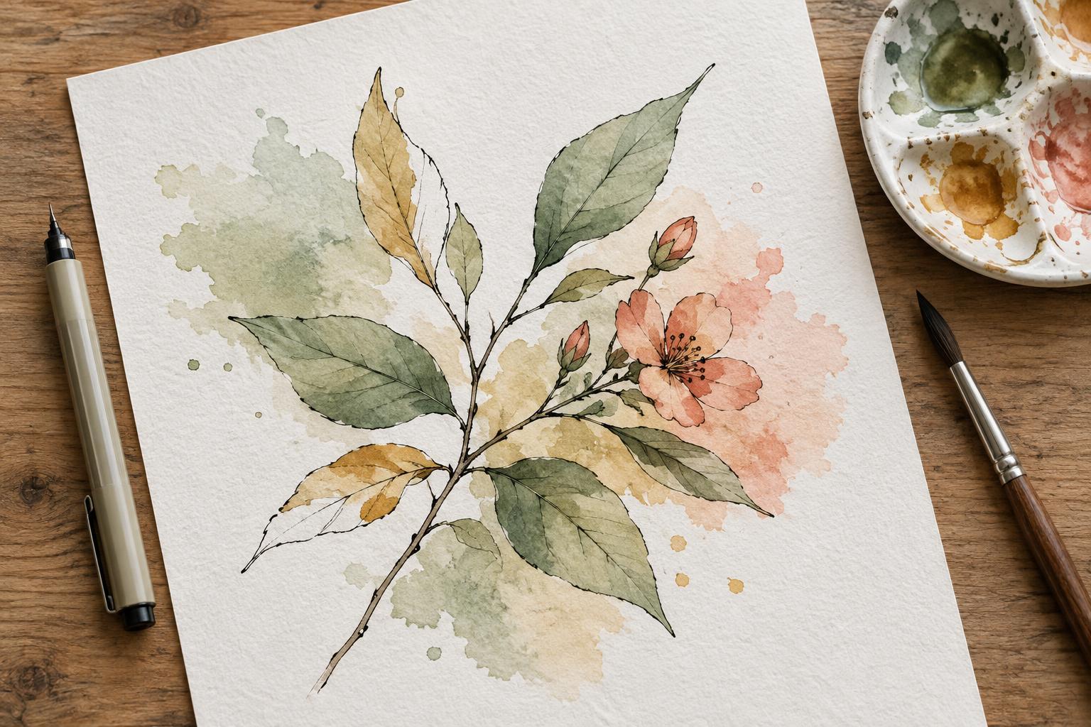
Ink and watercolor work best together when they do different jobs. Ink can define a silhouette, mark a facial expression or clarify where one object overlaps another. Watercolor can describe light, suggest texture and give a scene its mood. Before drawing, identify the few features a viewer must recognize immediately. Those features deserve the clearest lines; supporting surfaces can remain open for color.
Make a small value sketch using only light, middle and dark areas. If the main subject disappears when you squint at the sketch, adjust the shapes before adding detail. A dark outline around every object may seem like a reliable way to create clarity, but it can flatten the image. Reserve stronger lines for important edges and use thinner or broken lines where light strikes a form.
Test the materials before committing
The most important compatibility question is whether the ink will stay put under a wet brush. Draw a few lines on a spare piece of the same paper you plan to use, let them dry fully, then brush clean water and a pale wash across them. Check for bleeding, smearing and any change in line strength. An ink labeled waterproof may still behave differently depending on the paper, application and drying time.
Paper matters as much as the pen. Thin paper may buckle under a wash, making color collect in unintended places. Watercolor paper is designed to handle more moisture, though its texture can interrupt a very fine pen line. If your outline needs to be precise, try a smoother surface and use lighter washes. Testing a small corner can reveal how readily the paper absorbs both ink and paint.
Build an outline that leaves room for the wash
Begin with the largest shapes rather than filling every surface with marks. A clear outer contour and a few overlap lines often communicate more than dense interior hatching. Vary line weight intentionally: a firmer line beneath an object can add a sense of weight, while a lighter line along its lit side keeps the form from feeling boxed in. Leave some edges unfinished when a color boundary can carry the shape instead.
Think about where you want the viewer to look first. If the focal point is a person’s face, keep the eyes and expression readable while simplifying the pattern on a nearby wall. Details compete for attention regardless of whether they are made with ink or paint. Preserving quiet areas gives the watercolor space to show subtle changes without making the whole illustration equally busy.
Apply watercolor in a clear order
Start with broad, pale washes and let them dry before adding smaller shapes. This approach makes it easier to preserve light areas and judge how much contrast the picture still needs. Use a brush large enough to cover a shape smoothly; repeated scrubbing with a tiny brush can muddy the color and disturb the paper. You can darken a passage later, but lifting an overly dark wash is less predictable.
Keep neighboring colors from merging unless the soft transition serves the image. For a crisp edge, allow the first wash to dry before painting the shape beside it. For a softer edge, touch the second color into the first while it is still damp. Around the focal point, favor distinct value changes so the subject remains readable. Elsewhere, gentle transitions can help less important forms recede.
Restore only the details the painting needs
When the watercolor is completely dry, step back before adding more ink. A wash may have softened a line, but that does not always mean the line needs replacing. Look for specific gaps in understanding: an unclear hand gesture, an object that blends into the background or a shadow that has lost its edge. Reinforce those areas selectively rather than tracing the entire drawing again.
For a useful practice exercise, draw the same simple subject twice, such as a mug beside a folded cloth. On one version, ink every visible boundary before painting. On the other, ink only the silhouette and key overlaps, then let watercolor describe the remaining folds and shadows. Compare which version reads more clearly at a glance. The aim is not to make one medium dominant, but to let each mark earn its place.