Start with the outer shape
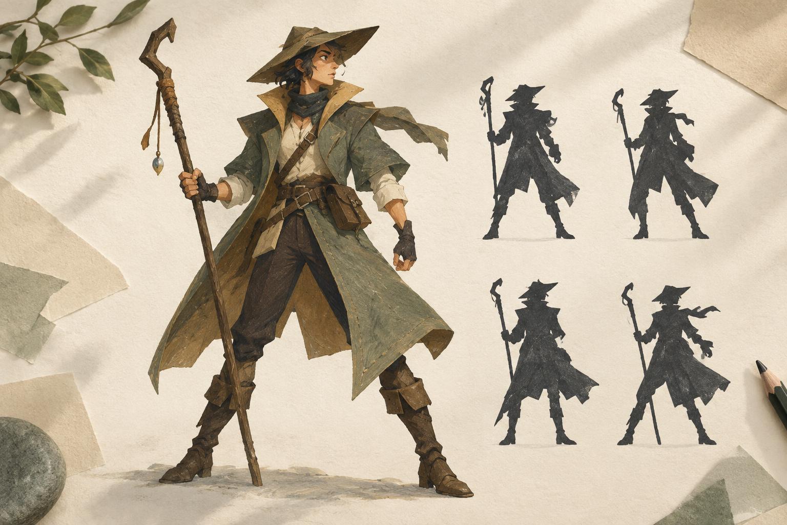
A silhouette is the shape a character makes when all interior details are removed. It does not need to reveal everything about the character, but it should give a viewer a quick sense of their proportions, posture and direction of movement. If the design only becomes distinct after you add a face, pattern or color scheme, the outer shape may need more work.
Begin with several small, solid shapes rather than a careful line drawing. Change one major feature in each version: the width of the shoulders, the length of the coat, the angle of the head or the shape of the hair. At this stage, large differences matter more than tiny refinements. Compare the sketches side by side and ask which ones you could recognize if they appeared in a crowded scene.
Build a clear hierarchy of shapes
A readable design usually has a few dominant shapes supported by smaller ones. A broad upper body above narrow legs, for example, creates a different impression from a long, uninterrupted column. You can exaggerate these relationships without making the character feel implausible. What matters is that the viewer can quickly see where the head, torso and limbs belong.
Try drawing the character as three connected masses: head, torso and lower body. Then decide which mass should carry the most visual weight. A large hood might frame the head; wide trousers might shift attention toward the stance. Once that basic arrangement works, add secondary forms such as sleeves, hair or a bag. If a detail interrupts the outline without helping the design, consider simplifying it or moving it inside the silhouette.
Use negative space to separate forms
The gaps around and between body parts are as important as the character’s outline. When an arm lies flat against the torso, it may disappear into one solid mass. Moving the elbow outward can create a small opening that makes both forms easier to identify. A wider stance, a bent wrist or a prop held away from the body can produce the same effect.
Check the spaces under the arms, between the legs and around anything the character holds. These openings do not all need to be large, and forcing them into every pose can make a figure look stiff. Instead, look for the few separations that explain the action. In a quiet pose, a slight gap between a hand and a coat may be enough. In a fast gesture, a larger opening might help show the path of an arm.
Make costume and props serve the outline
Costume can provide memorable shapes: a short cape, a tall collar or a sharply cut hem may distinguish a character even from behind. Props can help too, especially if they are likely to appear in many scenes. But attaching more items does not automatically improve recognition. Several similarly sized accessories can turn a clean outline into visual noise.
Choose details that reinforce the character’s role or habits and remain easy to draw repeatedly. Test a signature object in a natural resting position as well as an active pose. If it only reads when held at an awkward angle, it may not be a reliable part of the design. Keep important features clear of one another where possible; a hat brim merging with a raised hand can make both harder to read.
Test the design in its real context
Fill your drawing with one dark tone, remove interior marks and reduce it to roughly the size it might occupy on a page or screen. Can you still tell where the character faces and what they are doing? Place the shape beside other characters in the project, not just against an empty background. Differences in height, width and posture may become more useful than elaborate individual details.
A silhouette test is a guide, not a rule that every pose must pass perfectly. Some scenes call for overlapping figures or deliberately ambiguous shapes. For everyday poses, though, repeated confusion is worth investigating. Try changing the pose before redesigning the entire costume: turn the shoulders, separate a limb or shift the weight onto one leg. Keep the simplest version that communicates the character and leaves room for expression in the finished illustration.