Start with the kind of line you want
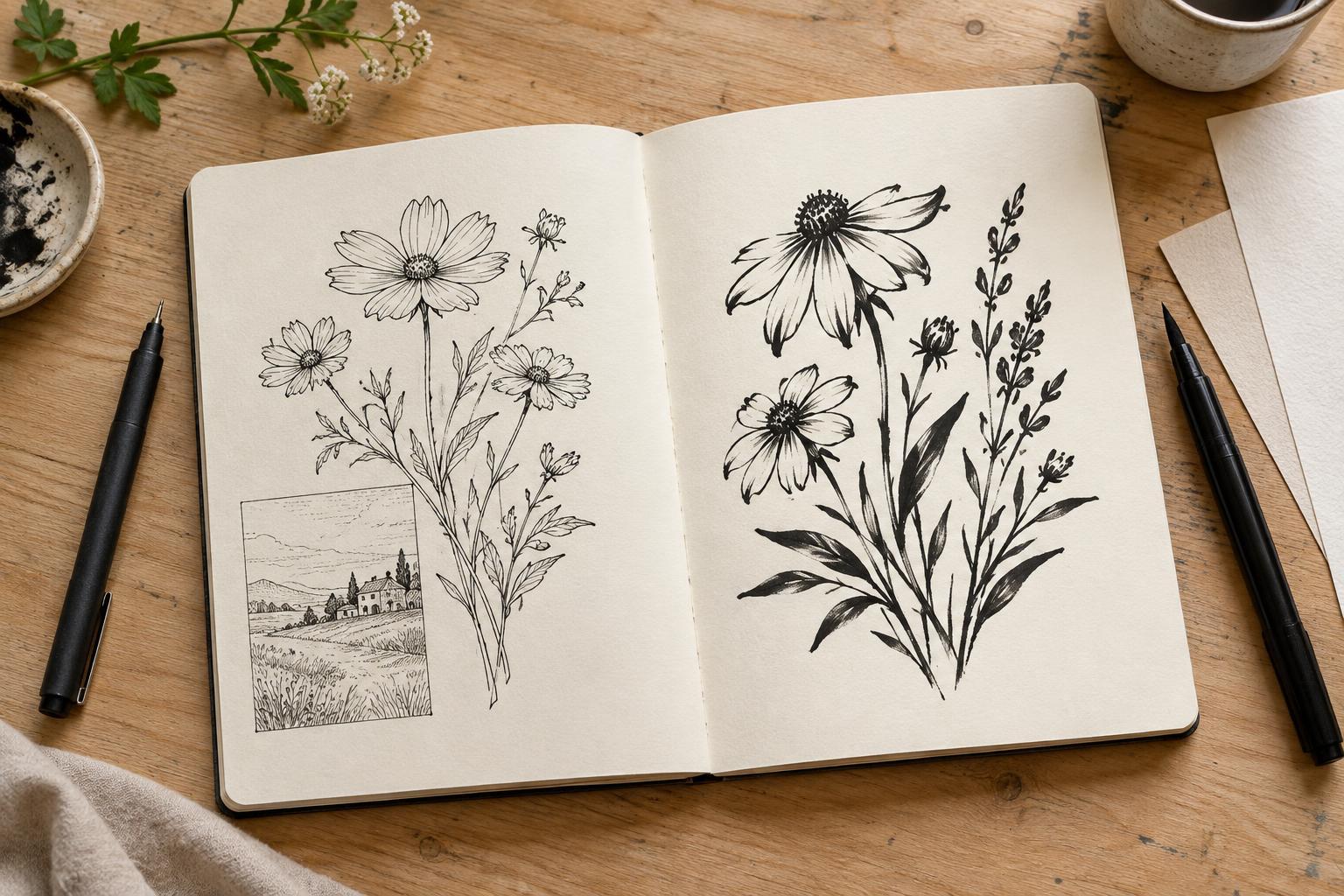
A fineliner and a brush pen can both turn a pencil sketch into finished ink art, but they invite different decisions. A fineliner is useful when you want a fairly consistent line and precise placement. A brush pen makes it easier to shift between thin and thick marks within one stroke. Neither is the better tool for every drawing: the useful question is what the line needs to do.
Imagine inking a panel with a character standing in a crowded room. A fineliner can separate small facial features, shelves and lettering with restrained, even marks. A brush pen can give the character a bold silhouette and add energy to a coat or a patch of shadow. Many illustrators would use both: one to establish clear details, the other to emphasize form and focus.
What a fineliner does well
A fineliner usually has a firm, narrow tip that helps you place short strokes, corners and small shapes. It suits patterns, architectural details, hatching and drawings in which lines should remain similar in width. Because the tip provides little variation under pressure, changes in weight often come from switching pens or drawing over a line a second time.
That predictability can make a fineliner comfortable for beginners. It also has limits. A very fine tip may catch on textured paper, while repeated passes can roughen some surfaces or create darker patches. If you work at a small scale, choose a line that remains legible when the image is viewed at its intended size; the finest mark in your sketchbook may disappear when reduced.
What a brush pen adds
A brush pen responds to pressure and movement. Pressing more firmly can widen a stroke; easing off can bring it back to a fine point. That range makes it useful for expressive contours, foliage, hair, fabric folds and areas where a heavier edge helps separate a subject from the background. It can also let you fill a small black shape without changing tools.
The trade-off is control. Fast strokes can be lively but uneven, and small features may take practice to ink cleanly. Brush pens also vary: a flexible felt tip does not feel the same as a pen with individual bristles. If a tool feels difficult, try drawing larger before deciding it is unsuitable. A line that seems unruly around a tiny eye may work beautifully around a full-page silhouette.
Check the paper and ink as a pair
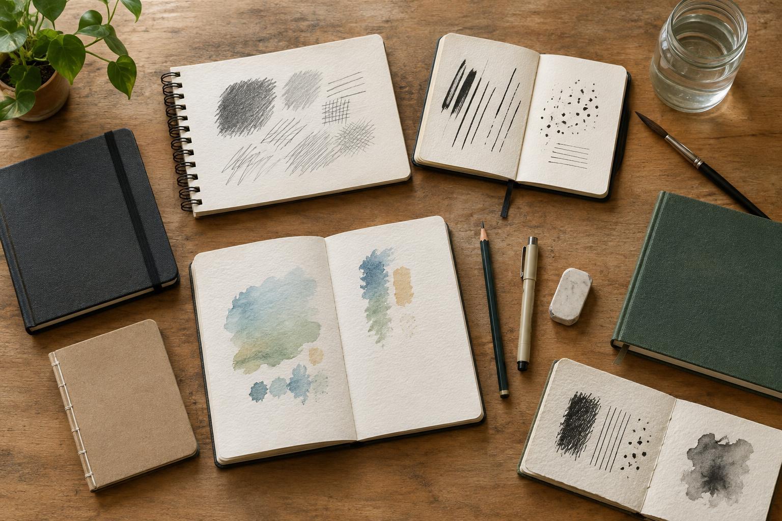
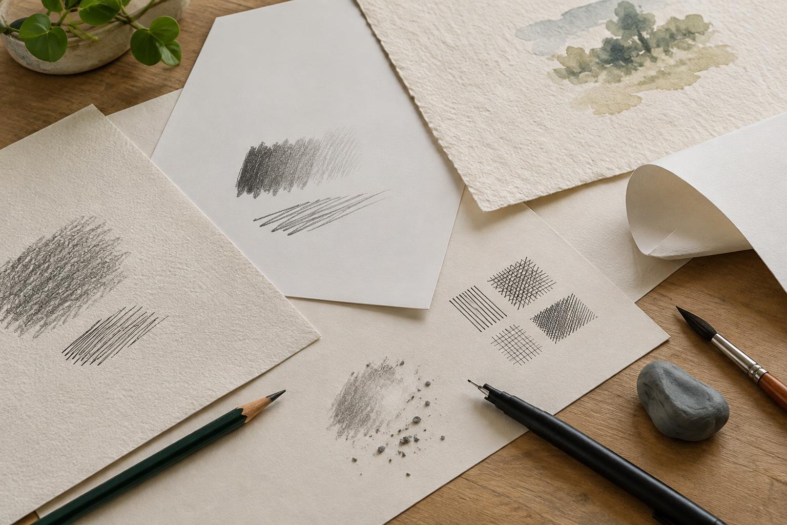
The pen is only part of the setup. Smooth paper generally supports crisp edges and lets tips glide, while textured paper may introduce broken marks or wear a delicate tip more quickly. Thin paper can show marks through the back or allow ink to spread. Before committing to a page, test a few slow lines, quick curves and filled areas on the paper you plan to use.
If you intend to add markers or watercolor, test that combination too. Ink labeled waterproof or water-resistant may still need time to dry, and different inks can react differently to the medium placed over them. Draw a small grid, let it dry, then brush or layer your color across it. Check for smearing, feathering and bleed-through. A test on the actual paper is more useful than assuming every pen of the same type will behave alike.
Choose through a short drawing exercise
Draw the same simple subject twice: a mug beside a plant works well because it includes straight edges, curves, overlapping forms and fine details. Ink one version with a fineliner and the other with a brush pen. Give both drawings the same time limit. Try outlines, a few interior marks and one dark area, then look at them from arm’s length as well as up close.
Ask which tool made the important shapes easier to read and which marks you enjoyed making. If the fineliner feels too flat, vary line weight by retracing selected contours or adding a second pen size. If the brush pen overwhelms details, reserve it for outer edges and shadows, then use a fineliner inside the shapes. The best choice may be a division of labor rather than a winner.
For a portable starter kit, one medium fineliner and one brush pen provide plenty to explore. Practice on the paper you actually use, and keep the marks that serve the image. A clear outline, a lively gesture and a readable panel matter more than committing to a single kind of pen.