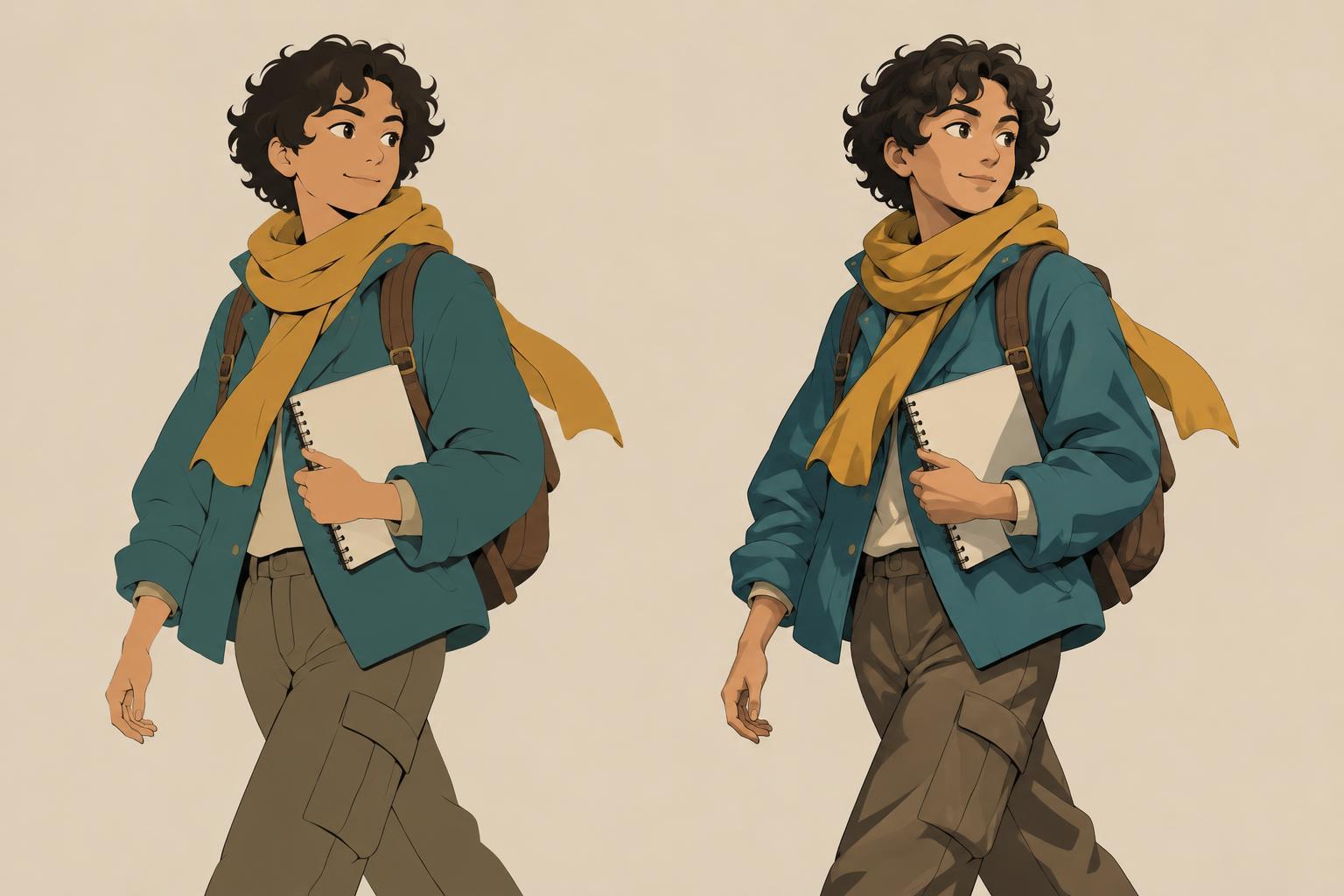
What each finish contributes
Flat coloring assigns clear color areas to a character without using shadows to describe the form. Skin, hair, clothing, and accessories may each have a distinct color, while line work, silhouettes, and overlaps explain how the pieces fit together. A flat-colored character can feel direct and graphic. It can also leave room for a detailed background, expressive marks, or a strong palette to do more of the visual work.
Cel shading starts with those color areas and adds shadows with relatively firm edges. Rather than blending gradually from light to dark, it divides a form into readable shapes of light and shade. A shadow under a chin can clarify the head’s position; a broad shadow on a sleeve can suggest a fold. The result is not automatically more finished than flat color. It simply places more emphasis on lighting and volume.
The useful question is not which method looks more sophisticated, but what the image needs to communicate. A character designed to be recognized at a glance may benefit from restrained color shapes. A dramatic close-up may gain something from shadows that direct attention toward the face.
Choose for the size and setting of the image
Consider where the character will be seen. At a small display size, a crisp silhouette and distinct color blocks are often easier to read than several narrow shadow shapes. If a shaded area is too close in value to its base color, it may disappear; if it is too dark, it may look like an unintended costume detail. Check the art at its likely viewing size before adding complexity.
The setting matters too. In a crowded panel or a scene with a detailed environment, flat colors can keep the character clear without competing with every background mark. Cel shading can help place a character in a space when the direction of light is important to the scene. If the character moves through several panels, however, that light direction must remain understandable as the viewpoint changes.
Mood is another consideration, though it does not dictate a single answer. A limited flat palette can feel bold, quiet, playful, or tense depending on its colors and shapes. Cel shading can make a scene feel theatrical or grounded, depending on the size, placement, and color of its shadows. Try judging the finish in context rather than on an isolated character crop.
Build a reliable flat-color foundation
Both approaches depend on good flats. Begin by separating the character into color regions that remain identifiable when the line drawing is hidden or reduced. Adjacent areas need enough difference in value, hue, or saturation to stay distinct. If a dark jacket merges into dark hair, a small shift in either color may do more for readability than a new highlight.
Think of flats as a way to organize attention. A vivid accent on a glove or scarf can draw the eye, while quieter colors let the face carry the expression. Repeating a few colors across the design can make separate costume pieces feel related. This stage is also a good time to test the silhouette against the background color: an appealing palette is less useful if the character blends into the scene.
If the image works with flats alone, shading becomes a choice rather than a repair. If it does not work, pause before adding shadows. Check the pose, overlaps, and value grouping first; lighting may emphasize an unclear structure instead of solving it.
Add cel shadows with a purpose
Before drawing shadow shapes, choose a simple light direction. Mark it briefly in your working file or keep it in mind as you move from the head to the feet. Then select a few places where shade will clarify form: beneath the hair, along one side of the face, inside a sleeve, or where clothing layers overlap. Large, deliberate shapes usually read more clearly than many small patches.
Keep the shadow palette manageable. A single shadow color adjusted for different materials can create a cohesive finish, while separate shadow colors may help if skin, fabric, and hair need to respond differently. Either way, check that the shadows remain distinguishable from the flats without obscuring important facial features or costume details. The boundary of a shadow is part of the drawing, so shape it as carefully as an outline.
Not every surface needs equal treatment. Leaving a bright accent or patterned garment mostly flat can preserve its design. Conversely, concentrating shade around the face can establish a focal point. This selective approach is especially useful when time is limited or when the character must stay consistent across multiple images.
Run a small comparison before committing
Make two versions of the same character pose: one with clean flats and one with only a few cel-shaded shapes. View them at full size, at a smaller size, and against the intended background. Ask which version makes the expression, pose, and important design details easiest to understand. Notice whether the shaded version adds information or merely adds marks.
For a series, repeat the test with a second pose or lighting situation. A finish that works beautifully in one portrait may be harder to maintain in an action scene. You can also settle between the two approaches: use flat colors for most of the character and reserve cel shading for faces, major overlaps, or scenes where light carries the story.
Choose the finish you can apply consistently and that supports the image’s purpose. Clear flats can be a complete visual statement. Cel shading is most effective when its shadows earn their place by strengthening form, focus, or atmosphere.