The difference you can feel
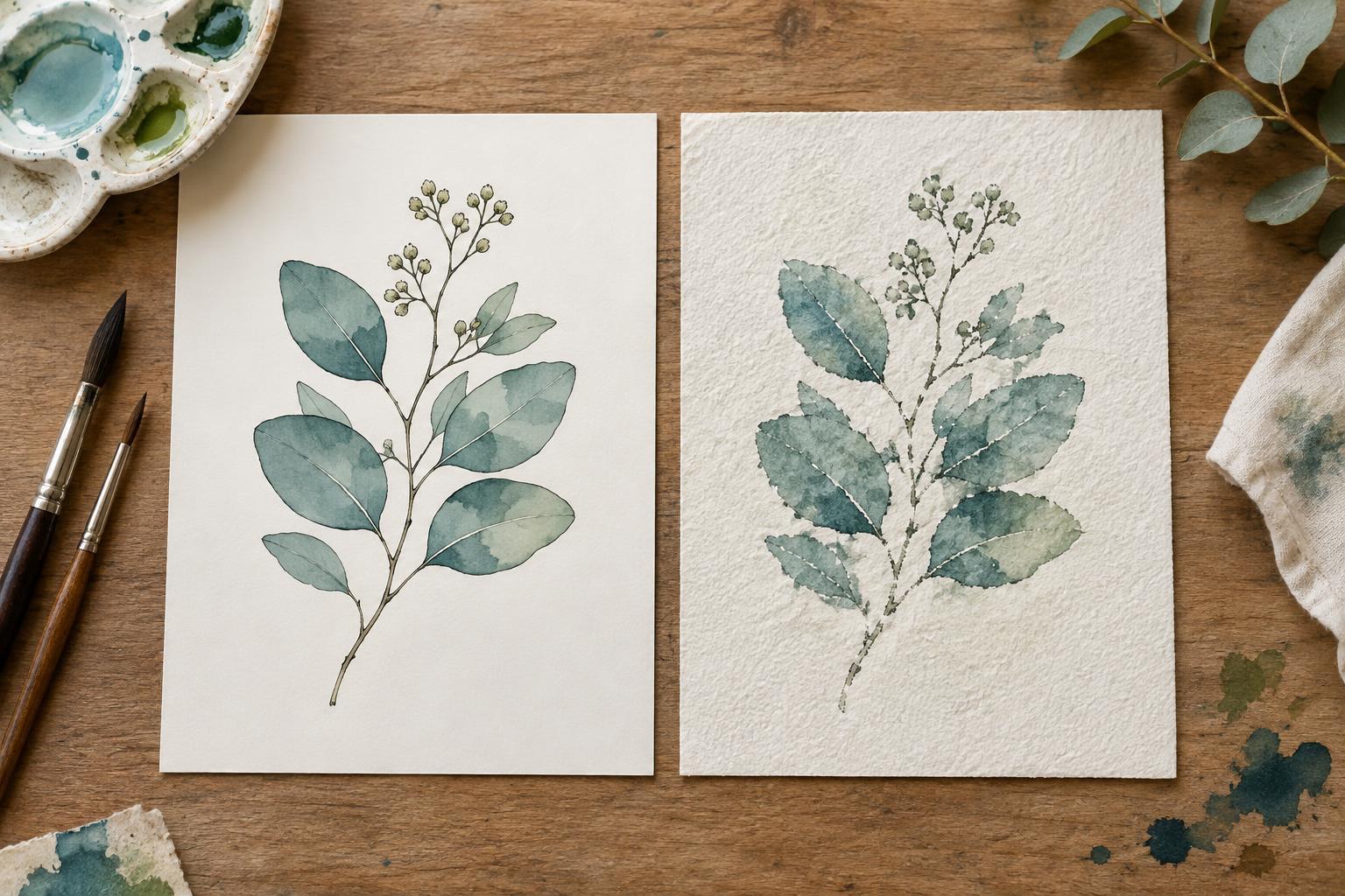
Hot-press watercolor paper has a relatively smooth surface. Cold-press paper has a more noticeable texture, often described as a soft tooth. Both are made for wet media, but that surface difference affects more than appearance: it changes how a pen moves, where pigment settles, and what a scanner or camera may pick up. Neither finish is automatically better for illustration. The useful question is what your particular image needs.
Paper texture also varies between brands and product lines. One cold-press sheet may feel only lightly textured, while another may have pronounced peaks and hollows. If surface character matters to a project, a small sample is more informative than the finish name alone.
When a smooth surface helps
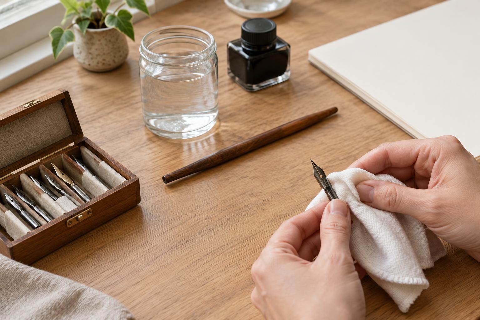
Hot-press paper is a practical starting point for illustrations built around precise outlines, small lettering, or fine details. A smooth surface gives a nib or technical pen fewer bumps to cross, which can make a consistent line easier to draw. It also tends to leave less visible paper texture in scanned artwork. That can save cleanup time when an illustration needs a clean digital background.
Smooth does not mean effortless, though. On some hot-press sheets, a watery wash may spread differently from what you expect, and brush marks or uneven edges can be conspicuous. Ink behavior depends on the pen and the paper’s surface treatment as well as its texture. Before committing to finished art, test whether your ink feathers, smears when wet, or resists an eraser after drying.
When texture earns its place
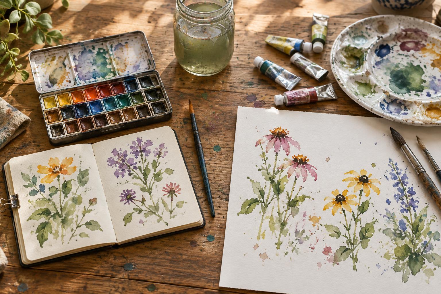
Cold-press paper can bring a lively surface to painted illustrations. Pigment may gather in its shallow hollows, making granulating colors and broken dry-brush marks more visible. That character can suit picture-book scenes, expressive backgrounds, or comic panels where the paint is meant to remain part of the final image rather than disappear into a perfectly flat reproduction.
The same tooth can interrupt very fine ink lines or make tiny lettering less predictable. It may also show up as light and shadow in a scan, particularly if the paper is photographed from one side. This is not necessarily a flaw: visible texture can make an image feel tactile. But if the final piece needs flat colors and crisp contours, decide whether you want to preserve that texture or spend time removing it during editing.
For work combining ink and watercolor, sequence matters. Let ink dry fully before adding a wash, and check that it is suitable for the amount of water you plan to use. If you prefer painting first and drawing afterward, test the pen on a dried painted area; pigment deposits and paper texture can change how its tip behaves.
Look beyond the press finish
Surface is only one part of a paper choice. Paper weight affects how a sheet handles water, although heavier paper is not a guarantee against buckling. The amount of water, the size of the sheet, and whether its edges are secured all matter. For broad, wet backgrounds, try your intended technique on a sheet of the size you will actually use. A small swatch may stay flat while a larger piece does not.
Surface treatment, often called sizing, affects how readily paint sinks in and how much you can lift or rework it. Papers with the same press finish can respond quite differently because of this treatment and their fiber composition. If you erase sketches, use masking fluid, or layer washes, include those actions in your test. A paper that takes a first wash beautifully may be less pleasant to revise.
Think about the finished format, too. A strongly textured sheet can be rewarding in an original painting but may produce more cleanup in a small printed comic panel. A very smooth sheet may support neat reproduction while offering less of the surface variation you want in a standalone watercolor illustration.
A quick test before choosing
Draw the same small scene on one sheet of each finish: a thin outline, a dark shape, a pale wash, a second wash over part of it, and a dry-brush stroke. Include a bit of lettering if your project uses it. Let both sheets dry, then look at them at their intended viewing size. If the work will be digitized, scan or photograph both using the same setup and compare the amount of editing each requires.
Choose hot-press when smooth line work and a quiet background are your priorities. Choose cold-press when visible paint behavior and surface character contribute to the story. If both matter, a lightly textured cold-press sheet or a smooth sheet with texture added through painting may offer a useful middle ground. The best paper is the one that supports your marks and your finishing process, not simply the one with the more familiar label.