Start with one visual idea
A spot illustration is a compact image that supports a larger piece of content. It might sit beside an article heading, break up a long page or give a repeated series of topics a shared visual language. Because it occupies little space, it cannot rely on a viewer noticing every mark. Its first job is to deliver one recognizable idea at a glance.
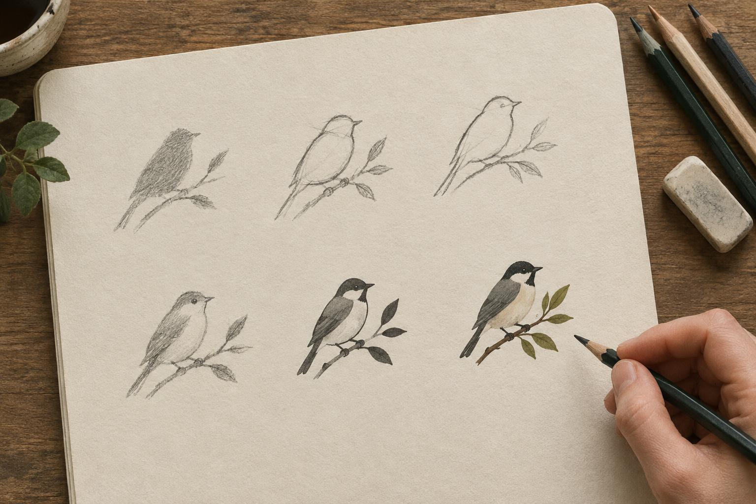
Before drawing, finish this sentence: “This image shows…” Keep the answer concrete. “A hand holding a pencil over a blank page” gives you more to compose than “creative possibility.” If the subject is abstract, find a visible action or object that suggests it. Make several tiny sketches rather than refining the first idea. At this stage, compare concepts by how quickly you can identify them, not by how much detail they could contain.
Build the silhouette before the details
Reduce your chosen sketch to a single dark shape. Can you still tell what it depicts? A distinct outer contour gives the viewer an entry point before they notice texture, line work or color. If two important forms merge, separate them with a gap, a change in angle or a contrasting shape. A pencil crossing a hand, for example, may read more clearly when its tip projects beyond the hand’s outline.
Pay attention to the spaces around and within the subject. A narrow gap that looks generous on a large canvas may disappear when the image shrinks. Open up important spaces, simplify overlapping parts and remove small protrusions that create a fuzzy edge. This is not the same as making every shape blunt: one carefully chosen corner, curve or gesture can carry the character of the drawing.
Give the eye a clear route
Decide what the viewer should see first, then make that area the strongest part of the composition. Contrast can come from a dark shape against a light ground, a saturated color among quieter colors or a sharp edge surrounded by softer ones. Avoid giving every object the same weight. If the image needs a person, a tool and a background motif, let one lead and make the others support it.
A spot illustration often sits near text, so its empty space matters as much as its subject. Leave breathing room around the outer edge, especially near a headline or caption. If the image will appear in a circular or square container, sketch that boundary early; do not assume a composition made for a wide rectangle will survive the crop. Check whether the subject remains balanced when placed in the actual page layout rather than judged alone on a blank canvas.
Use detail to clarify, not decorate
At small sizes, fine hatching, tiny facial features and closely spaced lines can blend into a patch of tone. Choose a few details that explain the subject or establish its mood. A single crease may show that paper is folded; a well-placed highlight may distinguish a glass jar from a solid object. Details that do neither can usually go.
Keep a simple value structure while you work. Try viewing the drawing in grayscale: if every part falls into a similar middle tone, the focal point may be difficult to find. Two or three broad value groups are often easier to manage than many slight variations. Color can add warmth and distinction, but it should not be the only thing separating essential forms. If the illustration might appear on different backgrounds, also check that its edge remains visible on each one.
Test at the size the reader will see
Do not wait until the image is finished to shrink it. Place an early version at its intended display size and step back from the screen or print it at approximate scale. Ask three questions: What do I notice first? What do I think it depicts? Which marks turn into clutter? If the answer to the second question is unclear, change the large shapes before polishing the lines.
Repeat the test after adding color and detail. Compare the full-size drawing with the small version and keep changes that improve the latter, even if they feel exaggerated up close. Thicker lines, wider gaps and a simpler background may look unusual while zoomed in but feel natural in context. Save a final glance for the illustration beside its text: the strongest spot image is not merely legible on its own, but useful to the page around it.