Start by deciding what the photo is teaching you
A photo can answer a specific drawing question: How does a sleeve fold when an arm bends? What makes a glass look transparent? Where does the shadow fall beneath a chair? Naming that question before you draw keeps the reference useful without making it a set of marks you feel obliged to reproduce.
Spend a minute looking before putting pencil to paper. Identify the subject’s largest shapes, the direction of the light, and the few details that make it recognizable. Then look away and describe those features in your own words. If you can say “narrow body, wide handle, dark underside,” you already have a plan for drawing a mug rather than copying its photographed outline.
Build a new drawing from simple forms
Begin with a small sketch made of basic volumes: boxes, cylinders, wedges, or rounded masses. Work from the subject’s overall gesture toward its parts. A standing figure might start as a line of action, a rib cage shape, a pelvis shape, and two lines for the legs. This gives you a structure you can adjust, instead of a contour whose every bend depends on the photo.
Next, choose where to depart from observation. You might lengthen a pose, widen a silhouette, flatten a curve, or shift the viewpoint slightly. Keep the underlying relationships understandable: a hand still needs to meet the arm, and an object still needs to sit convincingly on a surface. Stylization becomes clearer when a few changes are consistent rather than when every part is distorted differently.
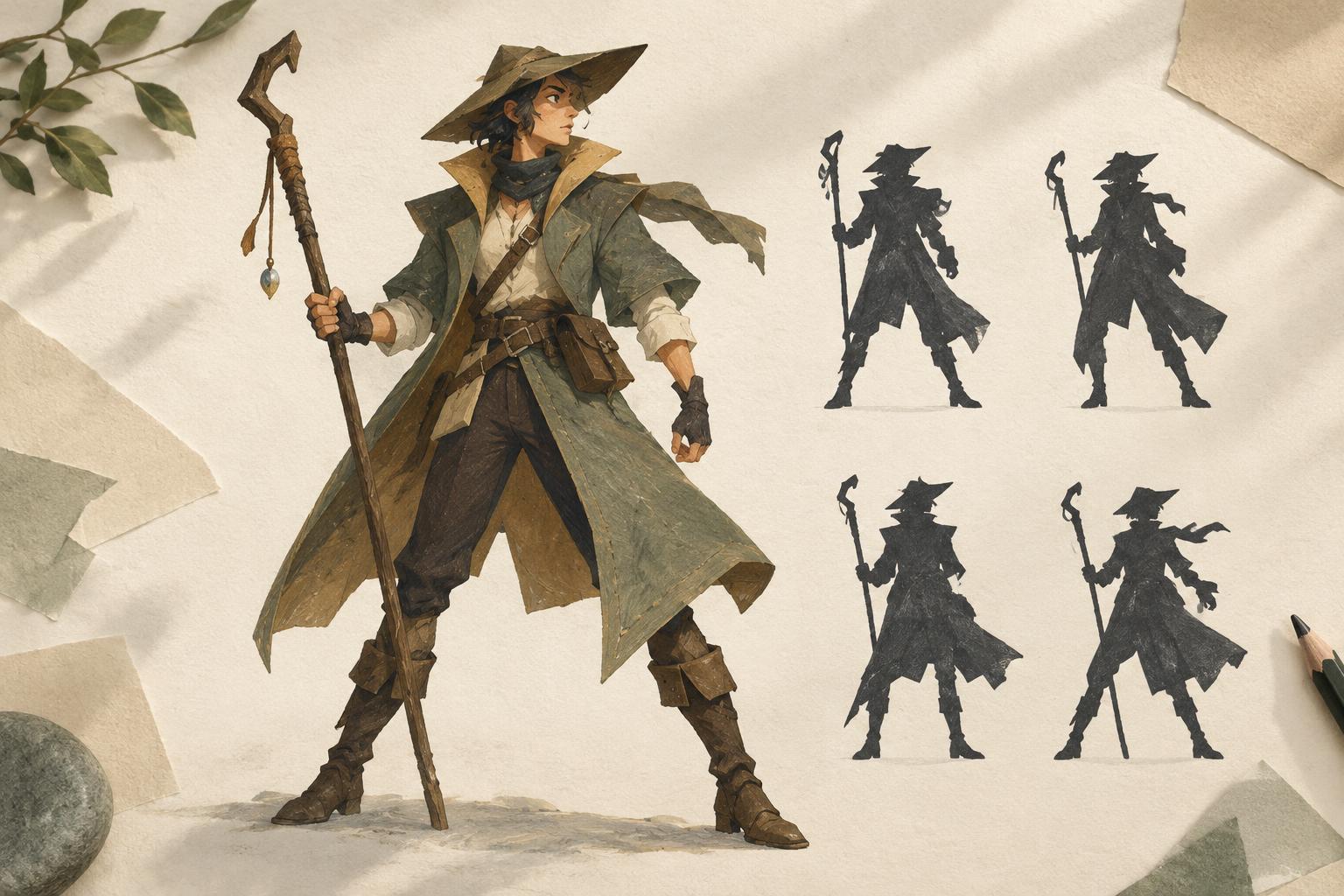
Try making three thumbnail sketches from the same reference. In one, emphasize angular shapes; in another, use soft curves; in the third, simplify everything to a compact silhouette. Keep each thumbnail quick enough that you must make choices. The exercise reveals which parts of the photo are essential to your idea and which are optional.
Simplify value and color on purpose
Photographs often contain more tonal shifts than an illustration needs. Squint at the reference to group its lights and darks, then draw a version using just three values: light, middle, and dark. Place the darkest value where it helps describe form or direct attention, not automatically wherever the camera recorded a shadow. Check the drawing at a small size; its main subject should still read.
Color can be treated with the same freedom. Instead of sampling every hue, choose a limited palette that suits the mood of the piece. A cool shadow and a warm highlight may communicate the lighting more clearly than many nearly identical colors. If the reference contains a distracting background, simplify or replace it so the subject remains the focus.
Let line and texture reflect your style
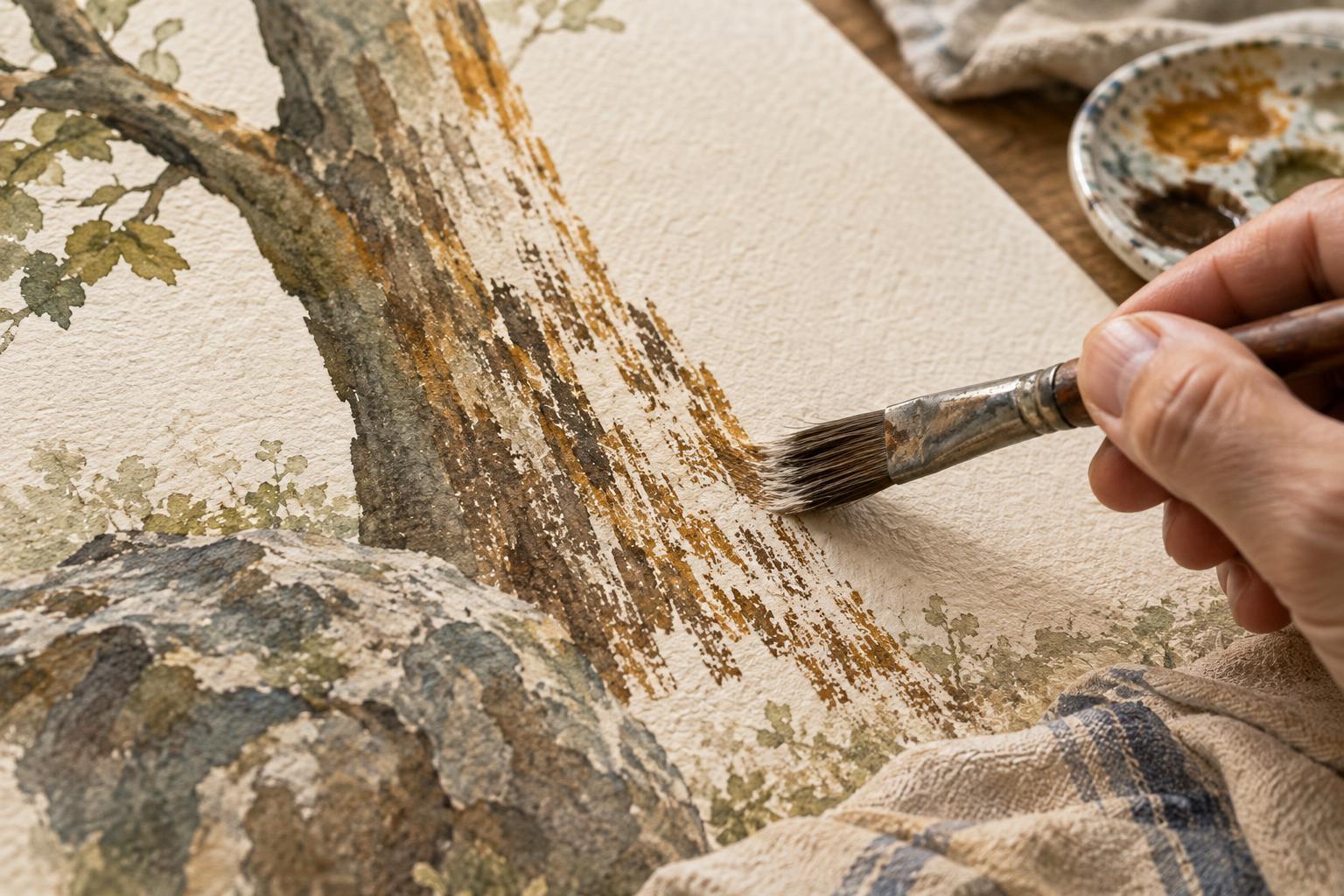
Once the large shapes and values work, decide how much information the finished image needs. A clean line drawing might use a heavier contour around the subject and lighter lines inside it. A textured illustration might reserve dense marks for the focal area and leave quieter passages nearly empty. Neither approach requires you to describe every edge visible in the photo.
Watch for details that belong to the photograph rather than to the subject. Lens distortion, a cropped fingertip, or a busy reflection can become confusing when copied into a drawing. Ask what each detail contributes. If removing it makes the illustration easier to understand, leave it out. If it explains material, action, or character, find a way to draw it in the visual language you have chosen.
Practice a repeatable reference routine
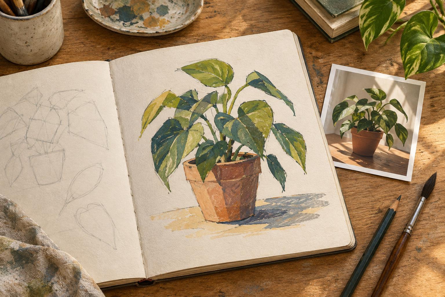
For a focused session, pick one question and one or more relevant photos. Observe for a minute, set the images aside, and draw several small studies from memory. Look back to correct a misunderstanding of structure or light, then close the references again before making a larger drawing. Moving between observation and recall helps separate what you have learned from the exact arrangement of pixels.
When a particular image is not yours, be thoughtful about how closely your final piece resembles it, especially if you plan to share or publish the work. Using several references for different questions, or taking your own photos when possible, gives you more room to compose independently. The goal is not to avoid observation. It is to use observation as material for decisions only an illustrator can make.