Think of a gradient as a series of overlaps
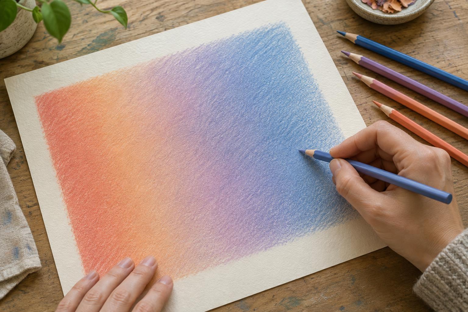
A smooth transition is not a sharp border with its edges rubbed away. It is an area where one color gradually gives way to another. Colored pencil is well suited to this approach because a light stroke leaves room for more pigment between and over the marks already on the page. Instead of trying to finish each part of a drawing in one pass, build the transition across several passes.
Before working on an illustration, draw a small rectangle as a test strip. Choose two related colors, such as yellow and orange, and mark where each should appear strongest. Leave a generous space between those points for overlap. A wider transition is usually easier to control than one squeezed into a narrow band. The same method can later be adapted to a cheek, a leaf or the lit edge of a piece of clothing.
Start with light pressure and a consistent stroke
Lay down the lighter color first, extending it beyond the place where the transition will begin. Use light, even pressure: the goal is a faint layer, not full coverage. Small circles can help disguise the direction of individual marks, while short strokes that follow the form can give a rounded object more structure. Either approach works if the marks remain close together and the pressure stays steady.
Add the darker color from the opposite side, letting it reach partway into the lighter area. Ease your pressure as you move toward the center. Then return with the lighter pencil and pass gently over the overlap. Repeat as needed, extending each color a little farther into the other. Compare the whole strip after every pass rather than concentrating on one stubborn patch; an even transition depends on how the neighboring areas relate.
Keep the pencil point shaped enough for the scale of the drawing. A sharp point reaches into the paper’s texture and suits small details, but it can leave visible lines if pressed hard. A slightly worn point may help cover a broader area. Neither point shape replaces controlled pressure.
Use intermediate colors with a purpose
Two pencils can create a gradient, but a third color often makes a difficult change easier. For a transition from yellow to red, an orange pencil can bridge the middle. Lay it lightly over both sides of the meeting area, then reintroduce yellow and red where their influence should be strongest. This gives you more control than pressing harder in the hope that two colors will blend.
An intermediate color does not always need to be the obvious midpoint. A muted pencil can help connect two subdued colors; a warmer or cooler one can shift the mood of a shadow. Test combinations on the same paper you plan to use, because the paper’s color and texture remain visible through light layers. A pencil that looks ideal by itself may behave differently over another color.
If the transition starts to look dull, stop adding new colors for a moment. Too many layers can obscure the clear relationship between the light and dark ends. A small test strip lets you find a workable sequence before committing it to the finished image.
Choose when to soften and when to preserve texture
Layering may leave tiny flecks of paper visible. That texture can be useful, especially in foliage, fabric or a sketch with an airy finish. If you want a smoother surface, first build enough color for the gradient to read clearly. Then make a light unifying pass with one of the pencils already in the mix, moving across the transition rather than stopping at its midpoint.
Burnishing is a different step: firm pressure with a light-colored pencil or a colorless blender compresses the layers into a smoother-looking surface. It can be effective for a polished highlight, but it may flatten texture and make further layering more difficult. Try it near the end, not as a shortcut at the start. Test the tool on a scrap first; a pale pencil may lighten or tint the colors beneath it.
For an illustration with both soft and crisp areas, blend selectively. A gradual shift on a curved surface can sit beside a hard edge at a cast shadow or silhouette. Making every edge equally soft can weaken the sense of form.
Troubleshoot the transition before adding more pressure
If the gradient looks striped, check where each pencil stroke stops. Visible bands often appear when colors meet at the same line on every pass. Vary the reach of your strokes and overlap them across a wider area. If the surface looks patchy, work lightly into the gaps rather than darkening the entire section. Turn the paper or view the drawing from farther away to spot uneven patches you may miss up close.
If the paper no longer seems to accept much color, pause. Heavy early pressure may have compressed its surface, leaving less room for adjustment. On the next attempt, use more light passes and reserve firm pressure for the final touches. A rougher paper may show more texture; a smoother one may make individual strokes easier to notice. Testing both can help you choose the look you want.
For a focused exercise, make three versions of the same two-color gradient: one with only the original pencils, one with an intermediate color, and one finished with burnishing. Keep the first layers equally light. Comparing the results will show which method creates the finish your illustration needs, rather than assuming the smoothest possible surface is always the best one.