What makes a glaze look clear?
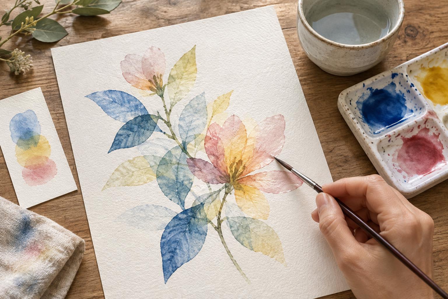
A glaze is a thin wash of color painted over a dry layer. Rather than covering what is underneath, it changes how that layer looks. A pale blue glaze over a yellow wash, for example, may create a green that feels different from green mixed on a palette. In an illustration, this approach can unify a group of shapes, deepen a shadow or shift the mood of a background without repainting every detail.
Clarity depends on more than adding water. A transparent-looking glaze needs a restrained amount of pigment, a surface that can accept another wash and a brushstroke that leaves the previous layer mostly undisturbed. Muddy color often comes from repeatedly moving wet pigment around, stacking too many competing hues or using a top layer that hides the one below.
Choose colors with the lower layer in mind
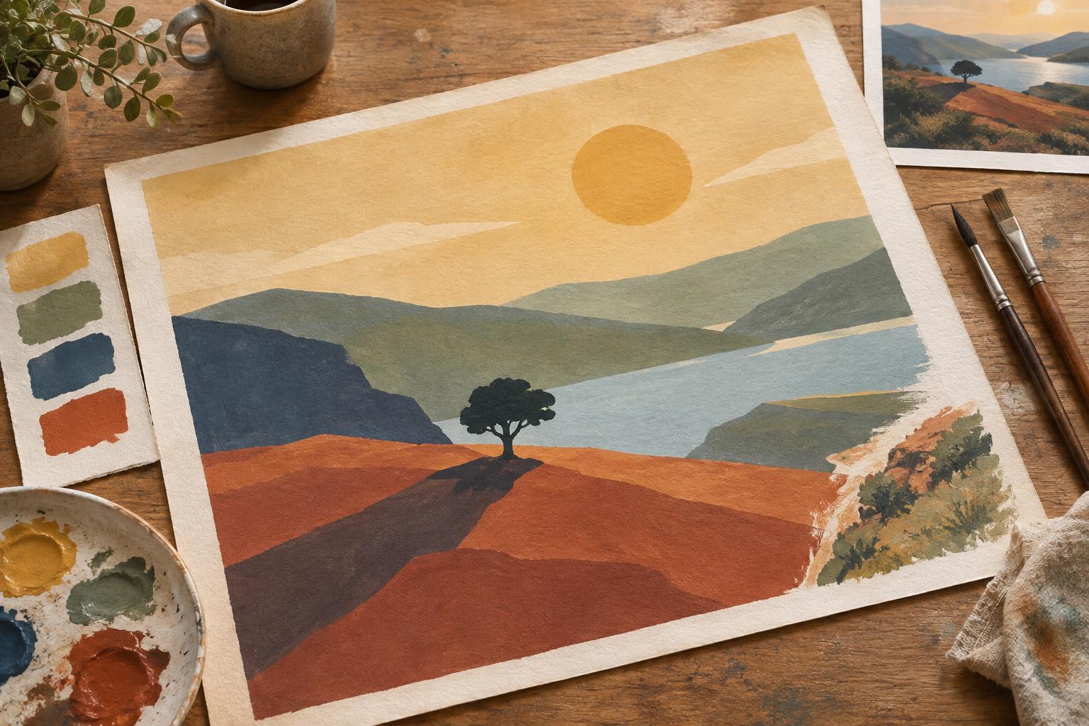
Before glazing a finished piece, make a small test strip using the same paper and colors. Paint the base color, let it dry completely, then add a stroke of each possible glaze. Compare the results after the tests dry. Watercolor often looks stronger while wet, so a wet test may not tell you whether the final relationship is subtle enough.
Think of the lower layer and the glaze as a pair. A related hue can deepen a shape while preserving its character: a cool blue over another blue may strengthen a night scene. A contrasting hue can be useful too, but it may neutralize the color beneath it. That can be exactly right for a quiet shadow; it is less helpful when the goal is a bright, clean passage. Start with two layers you understand before attempting a complex stack.
Paint labels can offer clues about transparency, but the behavior of a color also depends on its pigment, concentration and paper. Some colors leave more of the paper visible than others, and some granulating colors settle into the paper’s texture. Neither quality is a flaw. Testing shows whether a particular paint gives the smooth, clear effect you want.
Let each layer dry, then work once
Drying time is the simplest safeguard against accidental mixing. If a base wash still feels cool or looks slightly glossy, it may not be ready for a glaze. Waiting until the area is fully dry helps the upper wash sit over the earlier one rather than merging with it. It also makes the edge of a new shape easier to control.
Mix enough glaze for the whole area before touching the painting. Load a soft brush so it moves comfortably across the paper without dripping, then lay the wash down in a small number of deliberate strokes. Avoid scrubbing back and forth to perfect the color. Each return pass can reactivate or lift pigment from below, especially on paper that has already been worked.
If a wash looks uneven, decide whether the difference serves the illustration before trying to repair it. A second pass over a half-dry area can create a harder edge or disturb the first pass. Often the safer choice is to let it dry, assess it from a little distance and make one considered adjustment afterward.
Build depth without burying the first wash
Use glazes to answer a specific visual question. Does the focal figure need a cooler shadow? Should a wall recede behind a warm foreground? Is one corner too bright for the story’s atmosphere? A targeted glaze can solve that problem more cleanly than covering the entire illustration with another layer.
Work from lighter passages toward darker ones, protecting highlights as you go. A thin first glaze gives you room to judge the change before adding another. If every area receives the same number of layers, colors may become heavy and the intended hierarchy can disappear. Leaving some paper and early washes visible gives darker passages something to contrast with.
For a shadow, try a glaze that shifts both value and temperature rather than simply adding a much darker version of the local color. A restrained cool wash over a warm shape can suggest a change in light. Test the combination first: some pairs make a lively neutral, while others dull more quickly than expected.
Practice on a small illustration study
Draw a simple scene with three overlapping shapes, such as a cup, a leaf and the shadow they cast. Paint each shape with one light wash, preserving a few areas of bare paper. Once dry, glaze only the shadow side of the cup and part of the leaf. Use a separate test strip to compare a related-color glaze with a contrasting one before choosing.
When the study dries, look for places where both layers remain legible. Notice whether a muddy patch came from the color pairing, an overly strong mixture or repeated brushwork. Change one variable in the next study. Glazing becomes easier to control when each layer has a purpose and you give it time to settle before adding the next.