Start with the page’s job
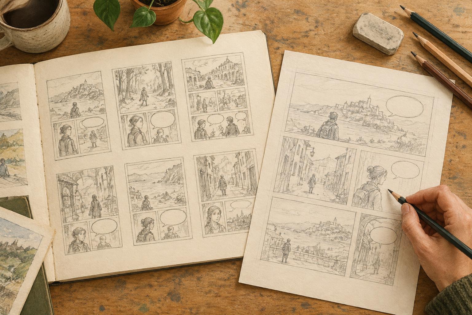
A thumbnail is a small, loose drawing of a comic page. It is not a miniature finished illustration. Its purpose is to let you make decisions while changes are still easy: which moments deserve a panel, how much space each moment needs and what the reader should notice first. A pencil and scrap paper are enough, though a digital canvas works just as well. Keep the page small enough that you cannot become absorbed in details.
Before drawing boxes, write one sentence describing what changes on the page. Perhaps a character enters a room and discovers it is empty, or two friends begin a conversation that ends in disagreement. Then note what the reader needs to understand by the final panel. This gives you a test for every choice in the thumbnail: does it help communicate that change, or is it taking space from something more important?
Choose the moments, not just the panel count
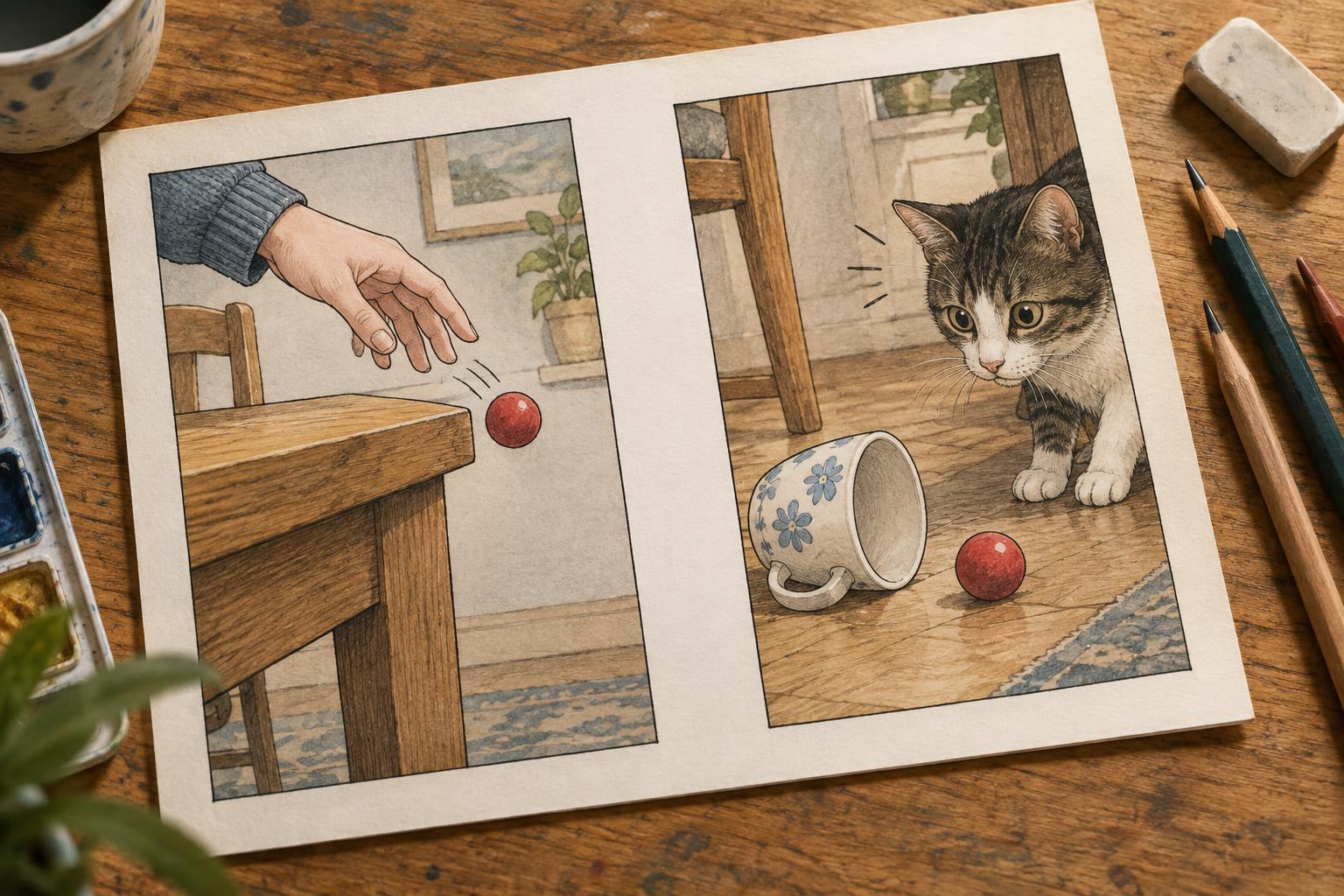
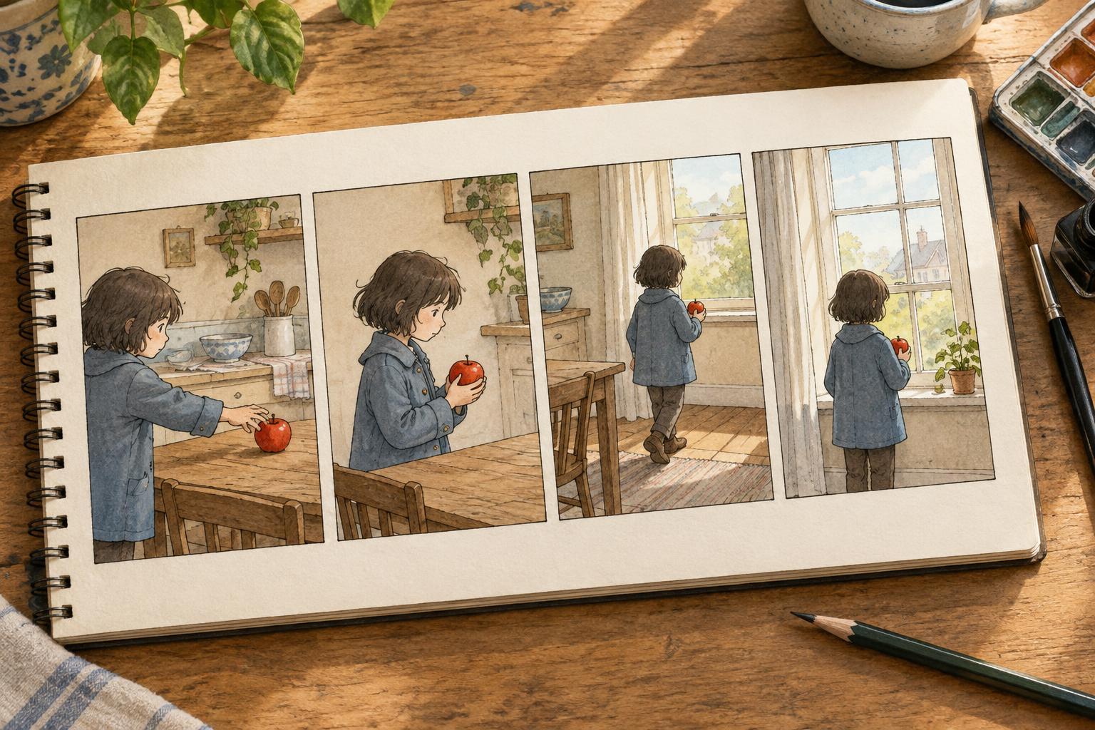
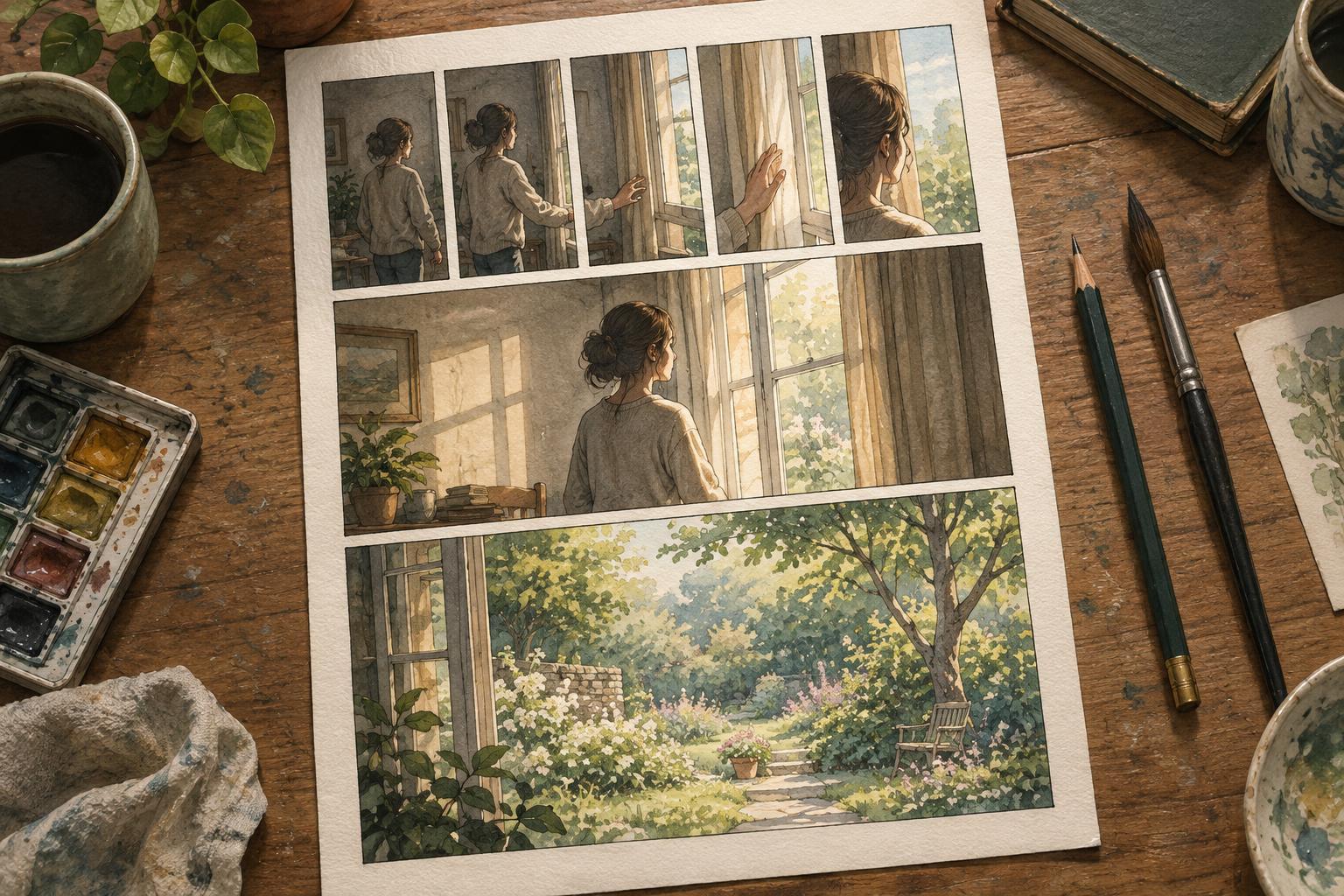
List the actions or exchanges that might appear on the page, then look for the moments that carry the story. A character reaching for a door, hesitating and opening it could occupy three panels if the hesitation matters. If the important event is what lies beyond the door, a single panel may be enough for the approach. Panel count follows the experience you want the reader to have; it need not be decided in advance.
Draw several tiny page rectangles and try a different arrangement in each. Use simple shapes for figures and objects. A large panel can give a reveal room to register, while a run of smaller panels can break an action into distinct beats. Neither choice has a fixed meaning: the images, dialogue and surrounding panels affect how it reads. Compare the versions by following them at normal reading speed, without stopping to explain your intentions.
Build a clear reading path
Once you have a promising arrangement, check the order in which a reader is likely to encounter its panels. Reading direction depends on the format and audience, so use the convention intended for your comic consistently. Within that convention, make panel borders and gutters—the spaces between panels—easy to follow. If two panels compete for the next position, revise their alignment or spacing before adding detail.
Inside each panel, place the important visual information where it can be found quickly. Mark figures with circles, arrows or rough silhouettes, and indicate the direction of a glance or movement. If a character looks toward the next panel, that can help carry the eye forward. Check for avoidable confusion as well: two characters who switch sides without a clear reason may be harder to track, even when each individual drawing looks good.
Reserve space for words and quiet
If the page includes dialogue or captions, put rough word shapes in the thumbnail now. You do not need polished lettering, but you do need to see how much room the text will occupy. Number speech balloons in the order they should be read. When that order forces a balloon across a face or makes the reader double back through a panel, try moving the figures, adjusting the wording or changing the panel layout.
Also look for places where no words are needed. A silent reaction panel may give a line of dialogue its consequence, while an establishing image may answer a question that a caption would otherwise have to explain. Silence is most useful when the drawing gives the reader something specific to observe. In the thumbnail, ask whether the pose, expression and surroundings will make that moment understandable without an added sentence.
Test, revise and move on
Review the thumbnail at its small size. Can you identify the focus of each panel? Is the most important beat getting enough space? Does the page end at a point that leads naturally onward? If possible, set it aside briefly and return to it without your notes. Places where you have to remember what a shape means may need a clearer silhouette, a different viewpoint or an extra panel.
Choose the strongest version and make a slightly larger rough layout before beginning finished drawings. This is the place to confirm expressions, background needs and balloon placement, not to perfect every line. Keep earlier thumbnails nearby; a discarded arrangement may solve a problem that appears later. The goal is not to remove every surprise from the drawing process. It is to give the page a readable foundation so you can spend more attention on the art that matters.