What the grade label tells you
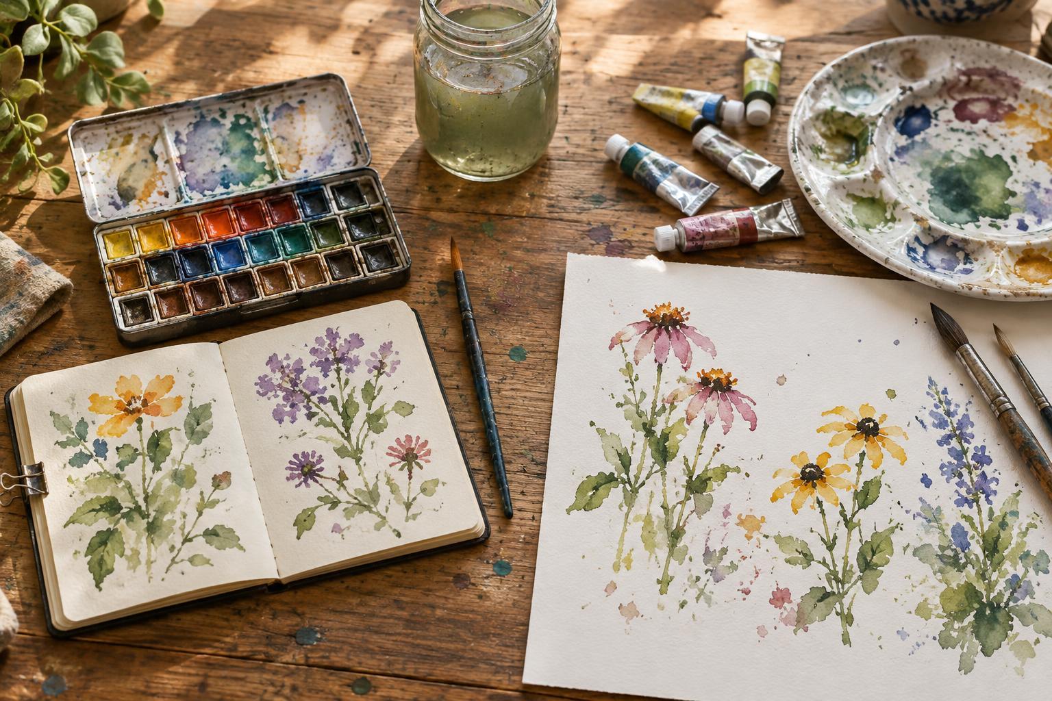
Watercolor is generally made from pigment held in a water-soluble binder, with other ingredients that affect how the paint flows and keeps. “Student-grade” and “artist-grade” describe product ranges, not a universal standard. Formulas vary between makers and even between colors in the same range, so the label is a starting point rather than a guarantee.
Artist-grade ranges often provide more detailed pigment information and a wider selection of single-pigment colors. Student-grade ranges tend to cost less and may use pigment blends or less expensive substitutes to achieve a familiar hue. Neither approach decides whether an illustration will succeed. The useful question is whether a paint gives you the color, handling and repeatability your work needs.
Color and mixing on the page
A paint’s strength becomes noticeable when you pull a wash across the page or mix a small amount into another color. Some artist-grade paints produce a strong color with less paint, while some student-grade paints appear softer or take more layers to reach a similar depth. These are tendencies, not rules: the pigment itself, the amount of water and the paper all affect the result.
Pigment information can be especially helpful when mixing colors for a recurring character or a series of illustrations. A single-pigment blue and yellow may yield a different green from similarly named paints made with several pigments. Mixed-pigment colors are not inherently worse; they can be convenient straight from the pan. But if a mixture repeatedly turns duller than you expect, checking its pigments may explain why.
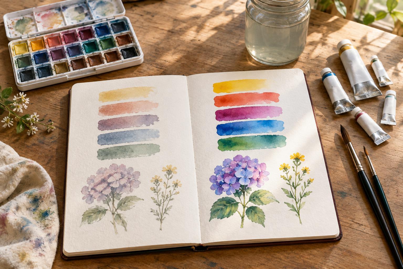
Transparency, granulation and staining also matter more than a color’s name. One blue may settle visibly into paper texture, while another makes a smooth wash. A staining color can be difficult to lift for a highlight, regardless of its grade. Keep a small swatch sheet showing each paint at full strength, as a pale wash and over a dry line of ink. It will tell you more about your own palette than the wrapper alone.
Handling, layering and permanence
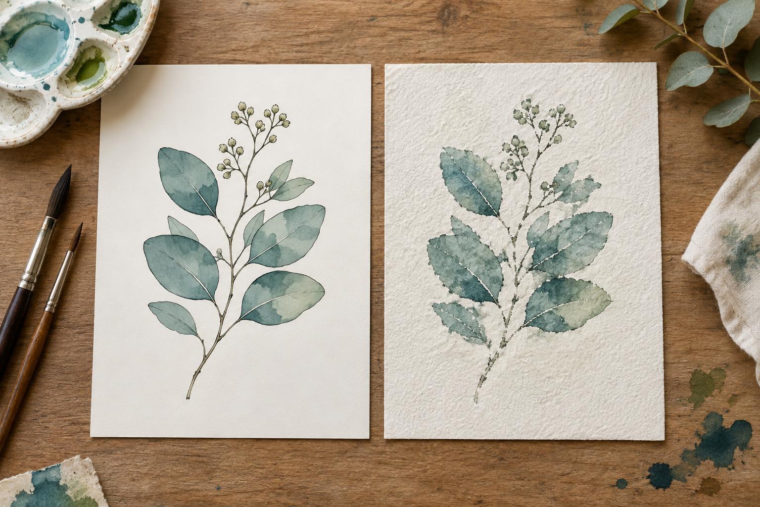
For visual storytelling, the way paint behaves from panel to panel can matter as much as the color. Try laying a flat wash for a sky, letting it dry completely, then adding a second wash for a shadow. Notice whether the first layer stays reasonably intact, how easily you can create a clean edge and whether repeated strokes disturb the surface. Paper quality and brush pressure influence all three, so compare paints on the same sheet.
If an illustration will be displayed in light, consult the maker’s lightfastness information for each color rather than assuming an entire grade is equally durable. Printed reproductions, scans and originals have different needs, but learning which colors you use in finished work is worthwhile. When permanence information is absent or unclear, treat it as an unknown—not proof that a paint will fade.
Where to spend a limited budget
A large artist-grade set is not the only path to useful color. A small selection of paints you understand can serve character sketches, spot illustrations and comic pages well. If you already own student-grade paint, keep using it while noting specific frustrations. Perhaps your dark mixtures take too many passes, or one frequently used red is hard to match across pages. Replacing that color is a more focused purchase than replacing the whole palette.
Set aside room in the budget for paper that tolerates the washes and revisions you like to make. A different sheet can change how paint spreads, layers and lifts, which makes it difficult to judge a new paint in isolation. A brush that holds a useful amount of water and comes to a dependable point can also make small illustrated details easier to control. Expensive tools are not required, but tools that suit the task make comparisons fairer.
A simple side-by-side test
To decide whether an upgrade helps, compare one student-grade color with a similar artist-grade color on the same paper. Label the swatches. Make a saturated mark, a diluted wash, a two-color mixture and a second layer after the first has dried. Then try lifting a small area with a damp brush. Use roughly the same brush, water and working time for both; otherwise, the test may reveal more about your technique than the paints.
Finally, paint a tiny version of an image you actually make: a character’s coat, a tree against a building or a three-panel sequence with repeated colors. Look for differences that survive the jump from swatch to illustration. If the less costly paint does the job, there is no need to upgrade for its label. If the other paint saves effort or gives you a result you cannot easily achieve, you have a clear reason to add it to your working palette.