What a visual motif can do
A visual motif is an image or visual pattern that appears more than once and gains meaning through repetition. It might be an object, such as a coat hanging by a door, or a less literal feature, such as narrow spaces, circular shapes or panels that repeatedly place a character at the edge of the frame. Unlike a background detail that simply recurs because the setting stays the same, a motif invites the reader to connect separate moments.
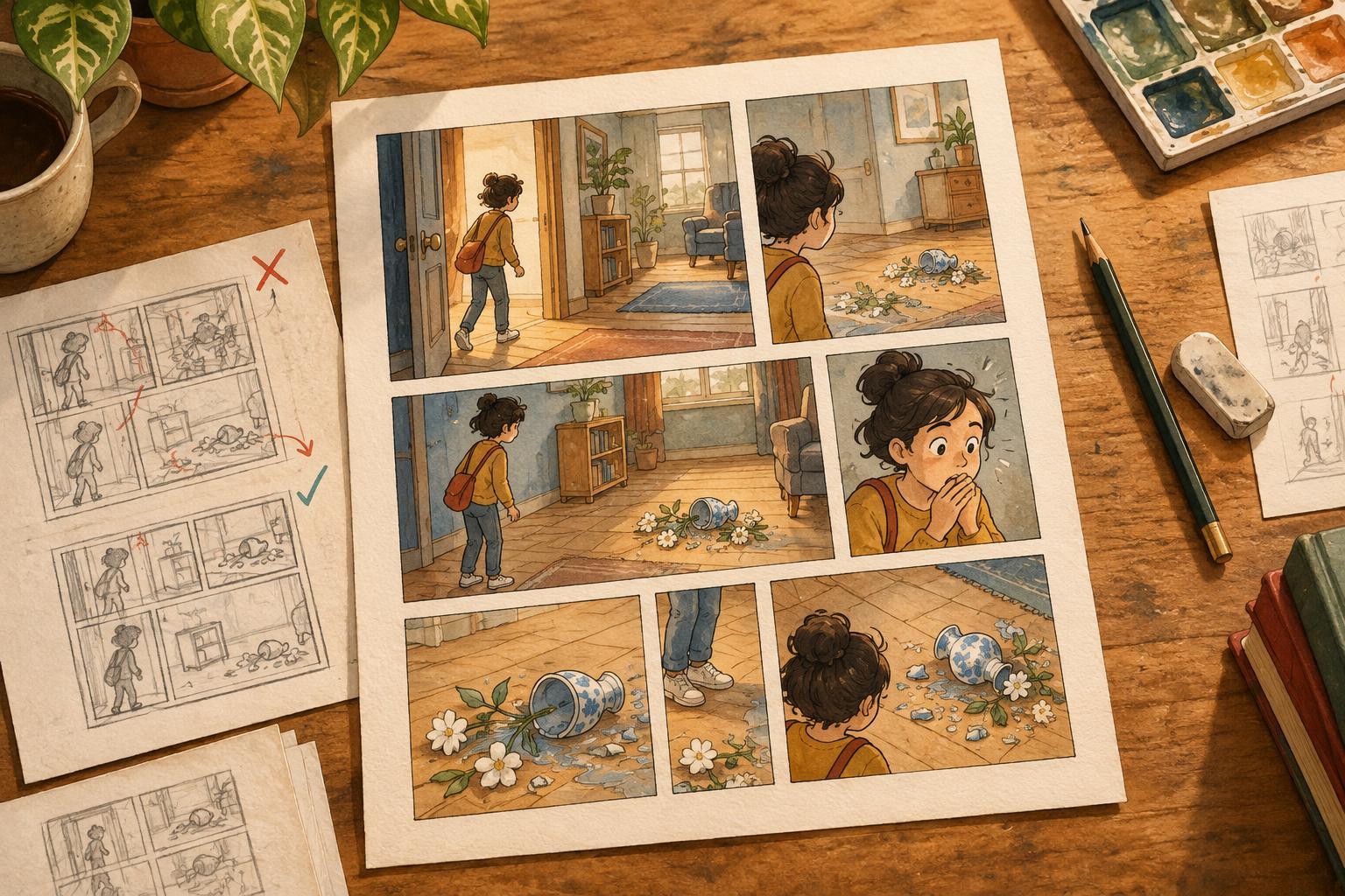
In comics, that connection can happen quietly. A cracked cup shown during an argument may return later in a calmer scene. The cup does not need to stand for one fixed idea; its condition, placement and relationship to the characters can suggest what has changed. A useful motif gives readers something to recognize while leaving room for them to interpret it.
Choose an image the story can carry
Start with a tension already present in the story rather than searching for a symbol to add afterward. If a character wants to leave home but keeps finding reasons to stay, thresholds might offer a useful visual thread. Doors, gates and the borders between rooms can appear naturally in scenes about that choice. The motif works best when it belongs in the character’s world as well as in the story’s larger pattern.
Try listing three images or arrangements that could recur without forcing characters to comment on them. Then ask what each one lets you draw. A motif should offer more than a single identical picture: a doorway can be open, blocked, seen from far away or cropped so tightly that it feels restrictive. Choose one with enough range to change as the story develops.
Be cautious about assigning a rigid translation, such as “every circle means safety.” Readers may notice repetition without reading it exactly as intended. If the emotional turn matters to understanding the plot, show it through character action and context too. Let the motif reinforce that turn rather than carry the whole explanation.
Plan appearances around story beats
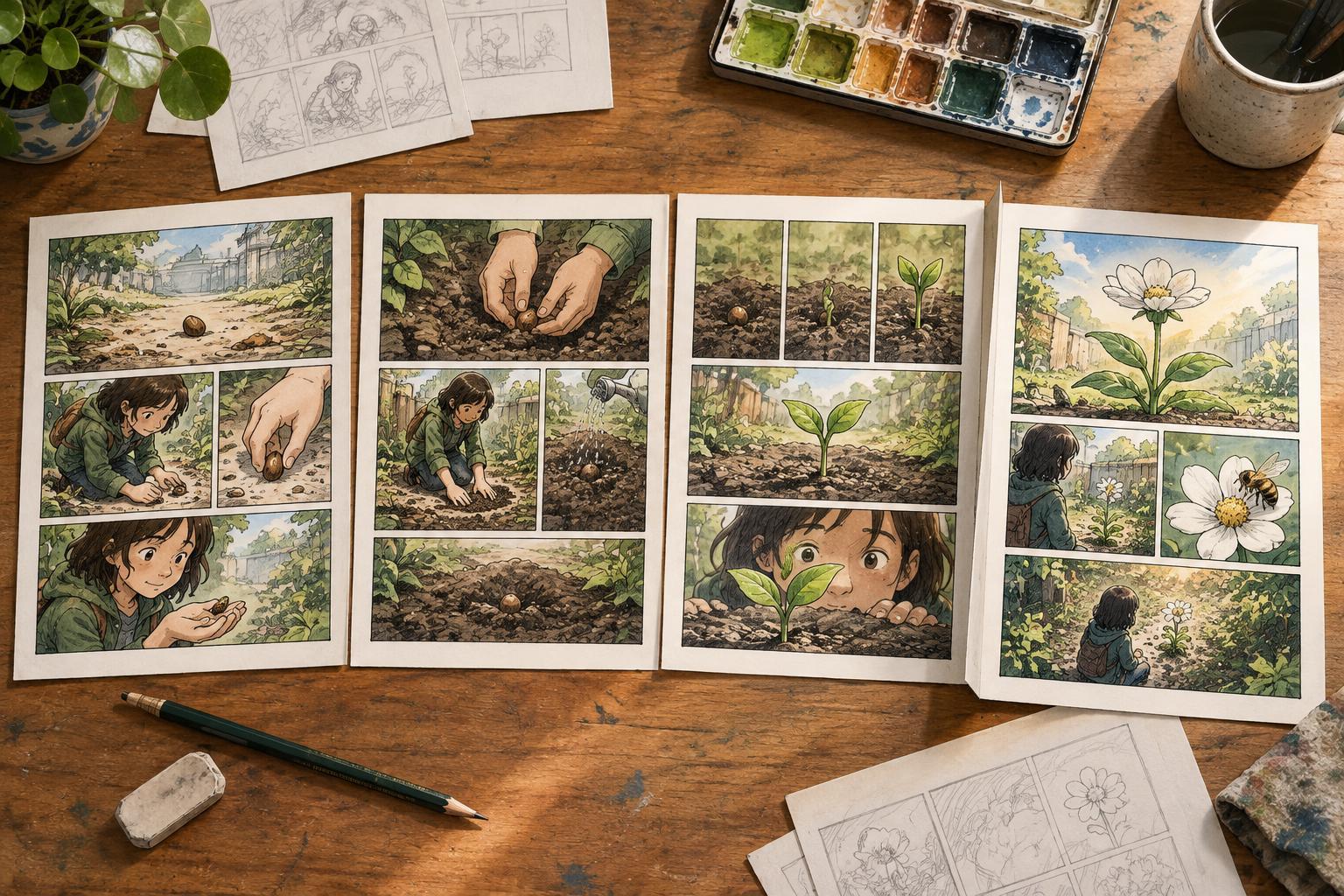
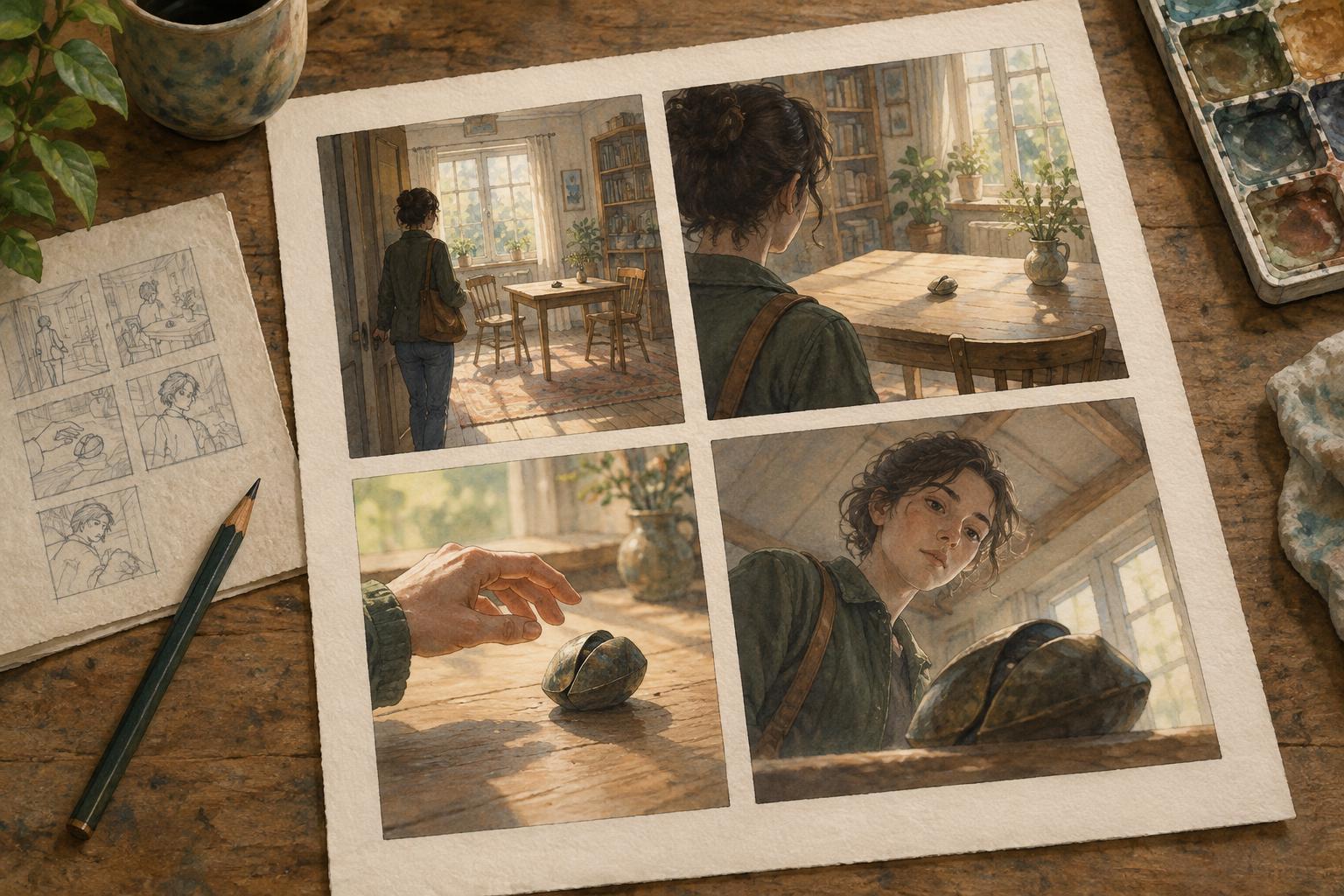
Mark the moments when the story’s central tension shifts: an introduction, a choice, a setback and an aftermath may be enough for a short comic. Consider whether the motif has a reason to appear at each point. Its first appearance can establish a visual baseline without drawing attention to itself. A later appearance can echo that composition so readers feel the relationship between scenes.
For example, an early panel might show a character paused outside a closed gate. After a setback, a similar panel could place the gate in the foreground, taking up more space than the character. Near the end, the gate might remain closed while the character chooses another path. The recurring element is recognizable, but the story comes from the changing action and framing.
You do not need to place the motif on every page. Repetition becomes more noticeable when there is space between appearances, and a comic already contains many visual rhythms: panel size, page turns, gestures and setting details. Use thumbnails to check whether the motif helps link key beats or merely adds another thing for the reader to track.
Vary the motif without losing recognition
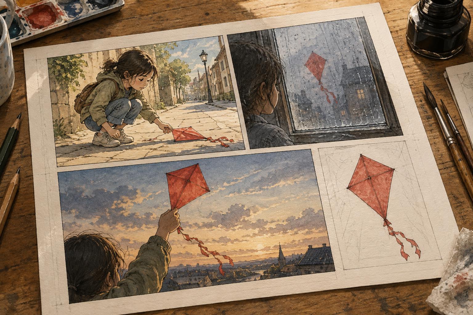
Variation keeps a motif from becoming a stamp. Change its scale, viewpoint, condition or role in the composition. An object initially held close might later sit untouched across a room. A repeated shape might move from the background into the panel border. These choices can reflect a change in how a character relates to the image without requiring a caption that explains it.
Keep at least one feature consistent enough to make the connection legible. That might be a distinctive silhouette, a repeated angle or the way the image is framed. If every appearance changes in size, color, position and context at once, the reader may not recognize the return. If nothing changes, the image may begin to feel decorative. The aim is a balance between familiarity and new information.
Consider the surrounding panels as well. A quiet motif can stand out after a busy sequence; a close-up can slow the reader before a decision. In a black-and-white comic, value and negative space may do more work than color. In a color comic, a repeated color can connect scenes, but it should not be the only cue if the motif needs to remain clear in different lighting.
Test whether the repetition earns its place
Once the pages are drafted, look at the motif’s appearances together. For each one, ask: What does the reader learn here that they did not know before? Does this image belong in the scene, or does the scene seem built only to display it? Remove an appearance as a test. If nothing changes in the rhythm or meaning, that instance may be unnecessary.
You can also show the pages to a reader without announcing the motif. Ask what images stayed with them and where they felt a connection between scenes. They may notice a different pattern from the one you planned, which can be useful rather than alarming. The goal is not to make every reader decode a secret symbol. It is to create visual continuity that rewards attention while allowing the story to work on a first read.