What an edge tells the viewer
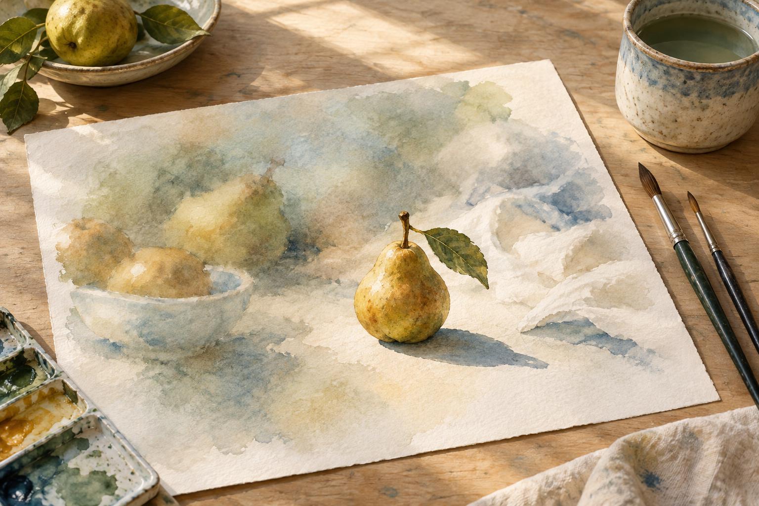
An edge is the place where one shape, value, or color meets another. It might be the dark outline of a hand against a pale wall, or the nearly invisible boundary between two similar shades of blue. A hard edge changes abruptly and is easy to locate. A soft edge changes gradually, while a lost edge becomes difficult to distinguish at all.
These differences affect how an illustration is read. A crisp boundary often asks for attention; a quiet one gives the eye permission to move on. Hard edges can clarify a gesture, expression, or important object. Soft edges can connect forms, suggest atmosphere, or keep supporting details from competing with the main subject. Neither is inherently more realistic or more skillful. Their value depends on what the picture needs to communicate.
Build an edge hierarchy around the focal point
Before rendering, decide what a viewer should notice first. In a scene of a person repairing a bicycle, the focus might be the fingers fitting a chain back onto a gear. You could give the hands and nearby metal parts a few decisive edges, then soften the rider’s clothing and the objects behind them. The entire hand does not need a sharp outline; the boundary that explains its action matters most.
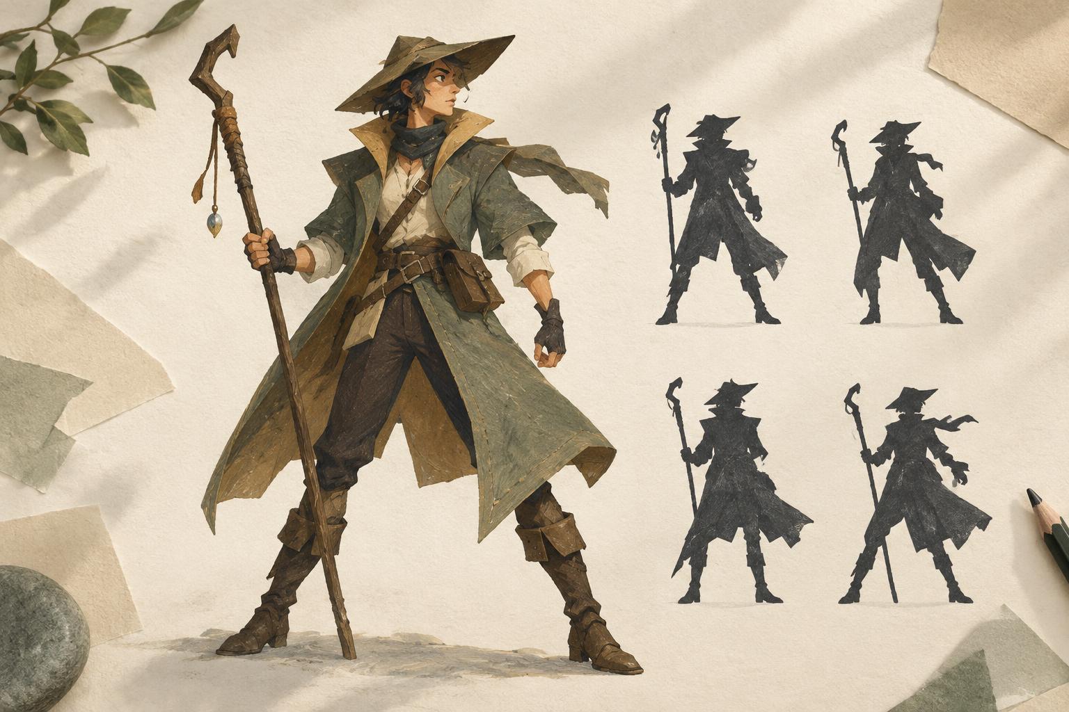
Think of edge sharpness as a limited resource. If every strand of hair, fold of fabric, and background object receives the same crisp treatment, they may all seem equally important. Instead, place your clearest edges near the focal action and use quieter transitions elsewhere. This is a hierarchy, not a rigid rule: a secondary sharp edge can help lead the eye toward the focus, while a softer area within the subject can keep it from looking cut out and pasted on.
Use value and shape to make edges work
An edge does not exist independently of the shapes on either side. A dark shape against a light one can appear strong even without an outline. Two similar values may form a quiet boundary despite a cleanly drawn contour. If your focal point is getting lost, check whether its value contrast is strong enough before adding more line work. If a background object feels too insistent, bringing its value closer to its surroundings may help more than blurring it.
Varying the boundary around a single object is often more convincing than treating every side alike. Imagine a cup beside a window: one side may have a clear silhouette against the bright opening, while the other side merges gently with a shadowed tabletop. Keeping the edges that describe the cup’s shape, but letting a less useful boundary fade, creates both clarity and visual breathing room. The viewer can still understand the object without being directed to inspect every part of it.
Choose techniques that suit the medium
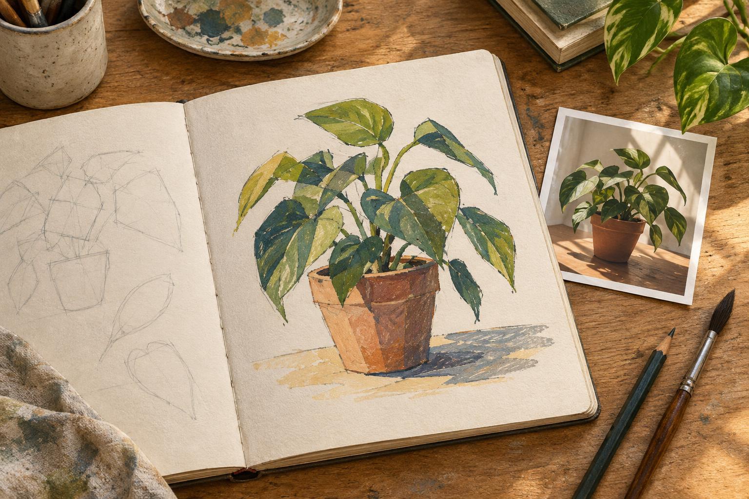
In pencil, a firm, confident stroke can establish a hard edge, while lighter pressure, closely spaced tones, or gentle blending can soften a transition. In paint, a hard edge may come from placing one shape against a dry neighboring shape; working into a still-wet area can produce a more gradual meeting. Exact results depend on the surface, paint, and timing, so a small test is often more useful than trying to force a particular effect in a finished piece.
In digital illustration, brush choice is only part of the decision. A clean shape on one layer can still feel soft if its value is close to the background; a textured brush can make a striking edge when the contrast is high. Use blur selectively rather than applying it to everything behind the subject. Broad, uniform blur can remove useful shapes and make depth feel mechanical. Painting simpler forms and reducing contrast often gives you more control over what remains readable.
Practice with a simple edge map
Try a small illustration with one focal action, such as a hand opening an envelope. Make a quick sketch, then mark three to five short stretches of boundary that must read clearly: perhaps the fingertips, the lifted flap, and the opening in the paper. Identify a few edges that can soften or disappear, such as a sleeve merging with a nearby shadow. Finish the study while resisting the urge to sharpen every contour.
Step back or view the image at a small size. Can you identify the action immediately? Does any unrelated detail pull your eye away? Adjust one edge at a time: sharpen a boundary that explains the action, or quiet one that distracts from it. Finally, compare the result with a version in which all edges are equally crisp. The goal is not to prove that softer is better. It is to notice how deliberate variation makes an illustration easier to follow.