Think in relationships, not color rules
Warm colors are commonly associated with reds, oranges, and yellows, while cool colors are associated with blues, greens, and violets. That division is a useful starting point, but temperature is often relative. A yellow-green may look cool beside an orange and warm beside a blue-green. Instead of asking whether a color is warm or cool in isolation, ask how it compares with the colors around it.
This matters when creating depth because viewers read an image as a set of relationships. A warm figure against a cooler wall may appear more distinct and closer, even if neither area is especially bright. Reverse the relationship and a cool figure can stand out against a warm room. Temperature does not create a fixed front-to-back order; contrast and placement determine how it works in a particular illustration.
Give each plane a temperature role
Start by dividing a scene into foreground, middle ground, and background. Choose one plane to carry the strongest warm-cool contrast, then make the other planes quieter. For a street scene, you might use a warm foreground sign, more balanced colors on the buildings behind it, and a cooler, less varied skyline. The gradual change gives the eye a path through the space.
A distant object does not always have to be blue. What helps is reducing the differences that make it compete with nearby objects. A far hillside might be a muted violet, a pale warm gray, or a soft green, depending on the scene. Keep its edges and value contrasts gentler than those of the main subject if you want it to recede. Temperature works best alongside these other depth cues rather than carrying the whole illusion alone.
In a crowded composition, reserve your most distinct temperature shift for the focal point. If every object alternates sharply between orange and blue, the image may feel busy rather than deep. Grouping nearby shapes into a shared temperature family can make a scene easier to read.
Use light to make the shifts believable
A simple lighting plan can guide your palette. Under a warm lamp, lit surfaces may lean warmer while areas outside its reach appear relatively cooler. In another setting, cool light from a window might fall across a subject while surrounding interior surfaces stay warm. These are options, not formulas: reflected light, local object color, and the mood you want can all change the result.
Before adding color, make a small value sketch with only light, middle, and dark tones. Check that the subject remains readable without temperature differences. Then add warm and cool colors while trying to preserve those value groups. If a bright blue background and a bright orange subject have similar values, their edges may compete even though their hues contrast strongly. Adjusting the lightness or darkness of one area often does more for clarity than changing its hue.
Try a limited-palette depth study
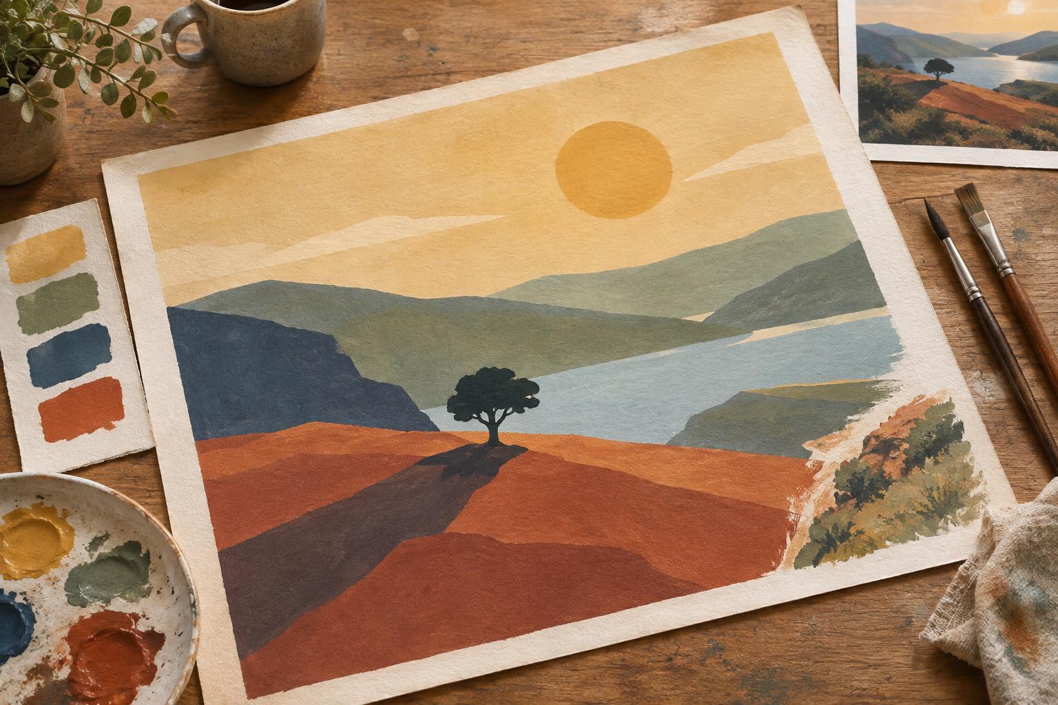
Choose a reference or invent a scene with an obvious near object, a middle-ground subject, and a distant backdrop. Make three small versions using the same drawing. For the first, place warmer colors toward the front and cooler colors behind. For the second, reverse that arrangement. For the third, keep most of the image close in temperature and use one contrasting accent at the focal point.
Limit each version to a few colors plus a light and a dark neutral. Work quickly enough that you are deciding on large areas rather than polishing details. When the studies are finished, view them at thumbnail size. Which one gives the clearest sense of distance? Where does your eye land first? If the answer is not where you intended, change the size, value, or position of the contrasting area before adding more colors.
This exercise is useful for comics as well as single images. Repeating a temperature plan across panels can help a location feel consistent, while a deliberate shift can distinguish a character from the setting or mark a change in attention. Keep essential actions readable in value so the sequence still works when colors are seen small.
Keep the final image flexible
Once the depth is working, you can break the pattern for a reason. A warm shape in a cool background might point to an important doorway. A cool highlight on a foreground figure might connect that figure to the light source. Such exceptions are easier to use when the larger color groups are already clear.
If an illustration feels flat, do not immediately add detail. Check whether foreground and background have similar values, sharpness, saturation, and temperature. Change one of those relationships at a time and compare the result. Warm and cool color is most effective as part of a deliberate visual hierarchy: it helps tell the viewer what is near, what is far, and what deserves attention.