What the labels actually mean
A colored pencil core contains pigment held together by binders and other ingredients. “Wax-based” and “oil-based” describe a general emphasis in that mixture, not two completely separate kinds of pencil. A pencil described as oil-based may also contain wax, and pencils within the same broad category can vary considerably in firmness, color strength and texture.
That is why the most useful question is not which type is better. It is how a particular pencil behaves with your hand, your paper and the marks you want to make. A soft pencil that covers an area quickly may suit a bold illustration. A firmer one may be easier to control when adding fine hatching to a small comics panel. Neither label guarantees those results on its own.
Feel, coverage and fine detail
Many wax-forward pencils feel soft and lay down color readily. With light pressure, they can produce a visible mark without much effort; with more pressure, they may fill the paper’s texture and create a smooth-looking area. The trade-off is that a soft point can wear down quickly. If your drawings rely on tiny lettering-like marks, crisp edges or closely spaced lines, you may need to sharpen more often.
Pencils sold as oil-based are often described as firmer, though this is a tendency rather than a rule. A firmer point can make it easier to place narrow lines or build a tone gradually through repeated strokes. It may take more passes to reach the coverage you want. Test the actual pencil before assuming it will feel hard or produce less color.
Pressure changes the comparison, too. Pressing heavily with either type can flatten the tooth of the paper, leaving less texture to catch later layers. Start with light strokes when you expect to add shadows, highlights or color adjustments. Save heavy pressure for passages you are nearly ready to finish.
Layering, blending and surface effects
Both types can be layered by placing one color over another. The ease of layering depends on the pencil’s formulation, how much material is already on the page and the paper’s surface. A textured sheet may hold several light applications before it looks full. On a smooth sheet, the same pencils may reach a slick, resistant surface sooner.
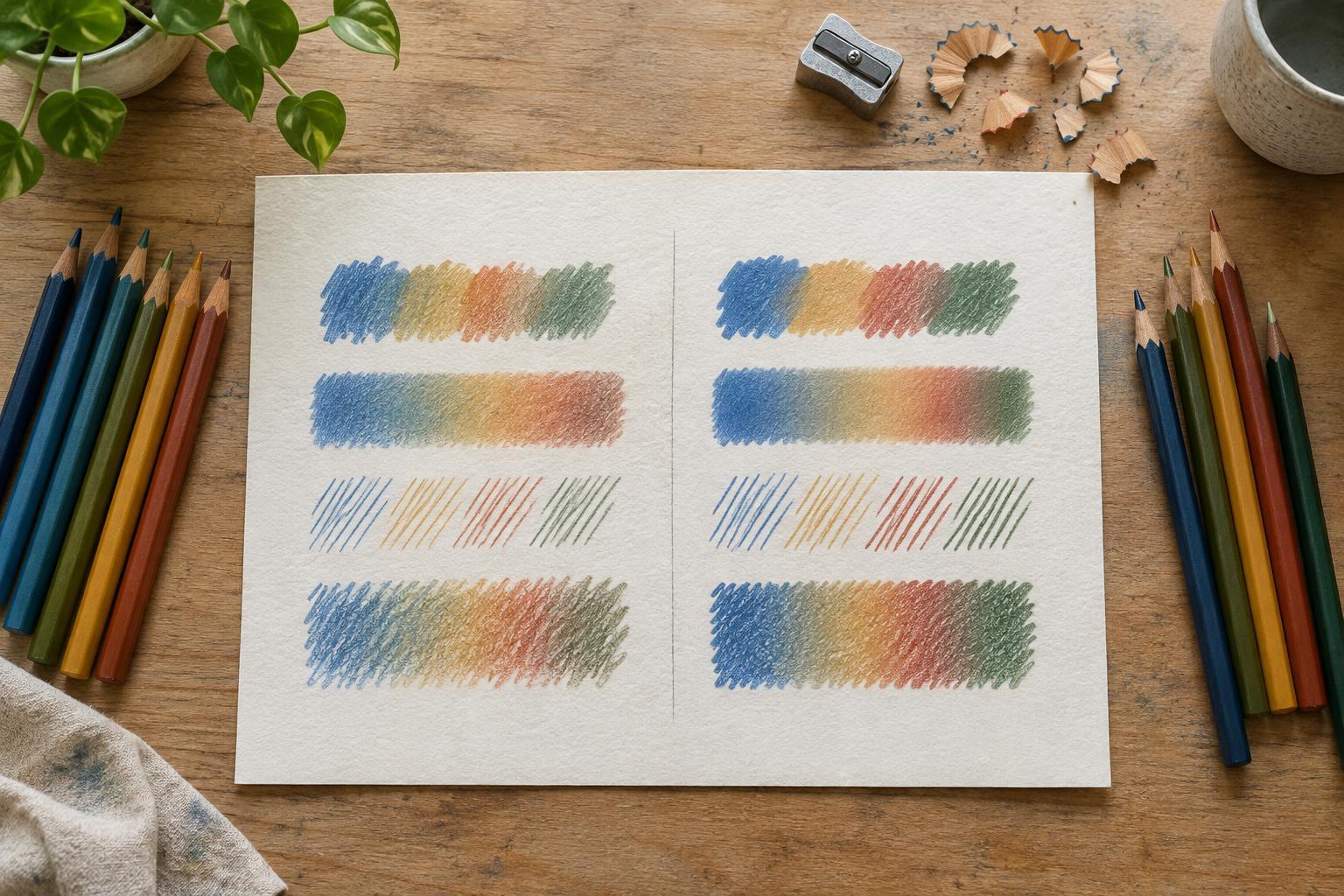
For a controlled blend, lay down two colors lightly, overlap their edges and repeat in small passes. If you want a more polished finish, use a pale pencil or the lighter of your two colors to press the layers together near the end. This technique, often called burnishing, can reduce visible paper texture, but it also makes further changes harder. Try it on a test patch before using it across a finished illustration.
A whitish haze sometimes appears on heavily applied, wax-rich color; this is commonly called wax bloom. It does not happen to every drawing, and an oil-based label is not a guarantee against it. A gentle wipe with a clean, soft cloth may remove the haze, but test first to avoid smearing nearby work. If a piece will be displayed or stored, follow any handling guidance supplied for the particular materials you use.
Paper and sharpening matter as much as binder
Paper can change the result more dramatically than switching between two pencil sets. A surface with noticeable tooth catches broken color and supports gradual layering. Smoother paper favors clean contours but may offer less room for repeated applications. For a fair comparison, draw with both pencils on the same sheet, using the same stroke direction and roughly the same pressure.
A sharp point helps with eyelashes, fabric edges, small objects and other details, regardless of binder. If a pencil breaks repeatedly, inspect the sharpener blade and try turning the sharpener around a steady pencil rather than pushing hard. A broader tip can be useful for filling areas: it spreads pressure and helps avoid grooves that remain visible beneath later color.
Keep a scrap of your chosen paper beside the drawing. Use it to check a newly sharpened point, remove loose crumbs and preview a color combination. This small habit is especially helpful when a pencil’s appearance on paper differs from its painted barrel or name.
A simple way to choose
Before buying a large set, compare a few individual pencils if that option is available. On one sheet, make a light-to-dark pressure scale, a patch of overlapping colors and a group of thin lines. Then try a small subject you actually like to draw: a leaf, a face, a fold of cloth or a panel-sized background. Notice how often you sharpen, whether the colors layer as expected and how your hand feels after filling an area.
Choose for the task rather than the label. Quick, broad color may lead you toward a softer pencil; patient detail may make a firmer pencil appealing. Many illustrators can use both in one drawing, provided they test how the particular pencils interact. The best set is the one whose behavior you understand well enough to repeat deliberately.